{Carrer web log}
CSS3 Chat Bubbles
Monday, December 20, 2010 { 13 Comments }
Few day ago I saw on Hacker News the link Creating Triangles in CSS from Jon Rohan(kudos to JON) and was specially interesting for the chat bubbles. Mainly because I was building one mini app for Twitter who should run on iPhone/iPad (webkit browser) so I needed simple solution for the chat bubbles.Jon uses this HTML :
<div class="chat-bubble">
Buongiorno!
<div class="chat-bubble-arrow-border"></div>
<div class="chat-bubble-arrow"></div>
</div>
I wanted to use just one div to create the same effect and make CSS to do all the heavy lifting:
<div class="chat-bubble"></div>
After some CSS hacking here is the result:
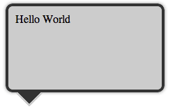
Example
Example1
Example2
Example3
Example4
From the examples you can see that everything is done with CSS and no images are used for making Chat Bubbles and also the HTML is super simple just one div and one class (<div class="chat-bubble"></div>).
The trick is using :before and :after pseudo-elements with combination of content: " " and absolute, relative positioning. In this case both :after and :before work in the same way because there are absolute positioned. This technique work in all modern CSS3 supported browsers.
If you have any questions please let me know in the comments.
All the examples are also on github for download.
[Update] Today Nicolas Gallagher point to me that he came to this technique 8 months ago Pure CSS speech bubbles . Unfortunately I didn't know about his post and I was careless not to check about other CSS chat bubble solution. And the worst thing is I have no prove beside my gentleman's word that I didn't copy his technique. Sorry Nicolas!
Line length and Font Size relation in design
Thursday, December 09, 2010 { 5 Comments }
There are many studies that are claiming that 60 characters per line is optimal reading size.Optimal is not necessarily fastest reading line length but is the size preferred by the users.
In the past I used that information for building Better Web Readability Project - CSS Typography Framework.
I stumbled to Christian Holst article "Readability: the Optimal Line Length" realizing that we came to the same conclusion about the proportion of the font size and line length.
Christian is using 17px font size and 520px column size.
I’m using 16px font size and 480px column size(for better readability project)
If you divide 480/16 = 30 or 520/17 = about 30
So the formula is:
Main Font Size X 30 = Optimal Columns Reading size
| Font Size | x 30 | Column Size |
| 12 | 30 | 360 |
| 13 | 30 | 390 |
| 14 | 30 | 420 |
| 15 | 30 | 450 |
| 16 | 30 | 480 |
| 17 | 30 | 510 |
| 18 | 30 | 540 |
| 19 | 30 | 570 |
| 20 | 30 | 600 |
| 21 | 30 | 630 |
I stopped at 21 px for the main font size because at some point the text will become too big and not serve its purpose.
Naturally you can’t just take 12px text and put it in 360px column and hope that everything will look great. The real design process is far more complex but is interesting when patterns emerge like in this case.
Here is demo.
Any thoughts?
Safari - open links in new tabs
Thursday, December 02, 2010 { 2 Comments }
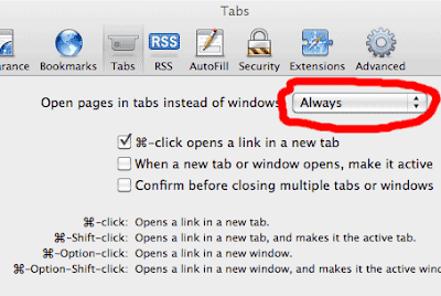
I bought MacBook Pro couple weeks ago and the one thing that bother me over and over again was that Safari is opening the links(by default) in new window. I felt like working with IE6 that didn't had tabs support. So I wanted to force Safari to open links in new tabs. The solution for that is little tricky. That is why I'm writing this short post.If you have older version of Safari you need to use Terminal. Open the Terminal.app and write : defaults write com.apple.Safari TargetedClicksCreateTabs -boolean
But that didn't worked for me because in the newer version of safari this solution is hidden in: Safari > Preferences > Tabs > Open pages in tabs instead of windows : Always
Enjoy!
Hacker News Mobile (Front Page Reader )
Thursday, November 25, 2010 { 2 Comments }
One of my favorite web site is Hacker News. Hacker News is the probably the best community for the people who want to experiment with new technologies and make their own online businesses.I decided to make mobile version for HN only for the front page news, mainly for the people who want to fast check front page news without consuming much bandwidth.
I basically striped everything leaving just the titles and the link pointing to the comments.
So here is image how I do it:

Everything is made with pure JavaScript and HTML and the content is optimized for iPhone, iPad and Android but can run almost in every browser with minimal JavaScript support (works even in IE5.5).
The application takes Hacker News RSS and with help of Yahoo YQL transforms into JSONP and then is processed by JavaScript.
If you don’t know what JSONP is here is my tutorial.
YQL is very cool technology here is one useful resource also see Christian Heilmann site . For now YQL is safe from being unplugging and I hope will it not have the same destiny like Yahoo BOSS.
All HTML, JavaScript, CSS and JSONP will weigh about 10kb. The Hacker News page is about 40kb so you will safe about 30kb.
But the main motivation behind this project wasn’t saving bandwidth but having clean essential page(yes, even more essential then now). I had trouble finding the story link among different links even I had clicked few seconds before on the link. So If you like it use it.
>>Link Hacker News Mobile
Did I mention that is compatible iPhone, iPad web app. Just tap to + bookmark button Add to Home Screen. It should also be compatible with Android.

Any suggestion, comments?
CSS Mobile Reset
Wednesday, November 17, 2010 { 12 Comments }
I’m not sure if the title of this project should be called CSS Reset or CSS Set or CSS Mobile Base. The goal is to provide default CSS for mobile devices.I started with this objectives:
- It should be small
- It should reset only the necessary HTML elements
- Should set only the necessary HTML elements
- It should provide better typography solution
Few years ago I build Hartija CSS Print Framework, the great thing about Hartija is that you have very fast print ready page. The same thing I want to achieve with the Mobile Reset to have content ready fast solution.
It should be small
Internet connection for mobile phones are still expensive and slow so smaller CSS file will provide faster download and better user experience.
Reset only the necessary HTML elements
All the browser implement CSS reset by default. I don’t think that is always smart to reset the reset. If you building complete CSS Framework is OK to reset everything but in many cases it is better to reset just the main HTML elements or the critical HTML elements.
Set only the necessary HTML elements
After resetting some elements it would be nice to set some HTML elements optimized for mobile phones.
We want to images not to be bigger than the mobile screen or if one word is bigger than the screen the word should brake.
We should provide meaningful base typography solution
Have you tried reading from mobile phone without zooming? I suggest to start with bigger font size. I implement 16px default font size. Feel free to change it. I also picked Arial like default font. Sans-serif can work well in some older low resolution mobiles.
And here is CSS Mobile Reset:
/* CSS Mobile Reset */
html, body
{
 margin: 0;
 padding: 0;
 border: 0;
}

body
{
 font-family:Arial,  sans-serif;
 line-height:1.5;
 font-size:16px;
 background: #fff;
 padding:5px;
 color: #000;
 word-wrap: break-word;
 -webkit-text-size-adjust: none;
}

h1, h2, h3, h4, h5, h6{ font-weight: normal; }

p img { float: left; margin: 0 10px 5px 0; padding: 0; }

img { border: 0; max-width: 100%; }

table { width:auto; border-collapse: collapse;border-spacing: 0; }
Download on GitHub
Demo1
Demo2
You can use CSS Mobile Reset with combination of Bulletproof CSS3 media queries.
Here is a Demo.
Any suggestions how CSS Reset can be improved?
About JSONP in JavaScript
Thursday, November 04, 2010 { 4 Comments }
Many people are confused about the use of JSONP. I want to explain the difference between JSON and JSONP in JavaScript.JSON (JavaScript Object Notation) is a lightweight data-interchange format.
Example of JSON:
{
"firstName": "Vladimir",
"lastName": "Carrer",
"age": 32
}
JSON works well with XmlHttpRequest (AJAJ/AJAX) but the main problem with XmlHttpRequest that is limited with same-domain browser policy. Meaning that you can’t use JSON for remote requests.
For that we have JSONP or "JSON with padding" or remote JSON.
JSONP is a "hack" of JSON in order to make remote request from different domain servers.
Example of JSONP:
AnyNameYouLike ({
"firstName": "Vladimir",
"lastName": "Carrer",
"age": 32
});
In this format(JSONP) can be injected like Script Tag Injection.
<script type="text/javascript"
src="http://someremoteserver.com/jsonp.js">
</script>
Then you call JSONP like this
function AnyNameYouLike (data) {
alert(data.firstName);
}
In order to parse AnyNameYouLike JSONP we have to have function named AnyNameYouLike.
JSON(P) web service usually provide callback parameter. So it looks like this:
http://someremoteserver.com/jsonp.php?callback=AnyNameYouLike
Meaning that the function name should match with the callback parameter.
It is important to remember that JSONP is not AJAX and doesn’t use XmlHttpRequest but the script tag.
JSONP is faster than JSON.
Because JSONP is actually hack to bypass browser security issues is considered not safe.
In the future will probably have something like Cross-Origin Resource Sharing (CORS) that hopefully will provide more safety.
But for now JSONP remains fastest and easiest way to obtain JSON from remote servers with JavaScript.
Let’s build some practical example.
We will use Yahoo YQL to parse reddit.com RSS. YQL will help us to convert RSS to JSONP.
The working Demo. Look at the code.
Did I miss something?
Two Lines CSS Framework
Tuesday, October 26, 2010 { 19 Comments }
I love to experiment with CSS layouts. One year ago I made 1 line CSS Framework now here is two lines CSS Framework. Both are mainly build for teaching purposes. Avoid using them in production.Last week I spotted the article "Announcing The Oxymoron CSS Framework" and I decided to "shrink it" preserving only display:table; and display:table-cell;
Here is the code:
.row { display:table; width:960px; margin:0 auto }
.cell { display:table-cell; vertical-align:top; padding-left:10px }
With this two lines of CSS you can build n. column grid system.
Five column system will look like:
<div class="row">
<div class="cell">1</div>
<div class="cell">2</div>
<div class="cell">3</div>
<div class="cell">4</div>
<div class="cell">5</div>
</div>
You can add as many "cells" as you like.
Here is the demo.
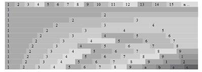
How this system works?
By combining display:table and display:table-cell you have the container(.row) and the columns(.cell), any row can contain many cells.
All cells by default are fluid. There is no need of Float and clearing. The width of all cells can be additionally defined. So there are literally endless combination of columns. You can mix px,em,% and fluid colmns.
Example 1
Code explanation:
.row {
display:table; /* The container */
width:960px; /* Any width, you can also use % and ems */
margin:0 auto /* Centered */
}
.cell {
display:table-cell; /* column */
vertical-align:top; /* align to top */
padding-left:10px /* the default gutter, you can personalize your gutter size */
}
Here are also two more examples:
Example 2
Example 3
So you can personalize your main width, columns size, gutter size, you can use %, ems or default fluid width and choose to center or not your main layout . Pretty powerful don’t you think?
Unfortunately this system will not work in IE 6/7 and some older browsers.
You probably noticed the similarities with classical tables coding approach (table, td, tr) and someone will think that this method is trying to reinvent the tables. What changes?
When the CSS is used for styling layouts the main goal is to separate the content from presentation. So in this case we have the CSS who is controlling the content without the use of table tags.
Today we are playing with the new CSS3 "make up" tricks forgetting that the main problem in CSS is the layout and we still don’t have good layout model who will satisfy all our designer needs.
This Framework is just an experiment that can help you understand different CSS layout models and coding approaches.
The code and the examples are also available on GitHub.
About the dollar sign ($) in JavaScript
Friday, October 15, 2010 { 11 Comments }
I’m writing this short post because I think that many people are puzzled by the $ sign in JavaScript. When I started using jQuery I thought that the $ sign have some super powers or do some Voodoo magic.The truth is the dollar sign is "special" in JavaScript but unfortunately doesn’t do Voodoo magic.
Why the $ sign is special?
Because you can do this: var $ = "Hello World";
But you can’t do this: var £ = "Hello World"; or var @ = "Hello World"; or var # = "Hello World";
The $ sign is "special" because is treated like any normal letter (a,b,c …).
So the $ is cool sign that probably every keyboard have and is perfectly legal to use. Probably because of that John Resig decided to give him special role in JQuery and later the $ sign was implemented by Prototype and MooTools. How jQuery and the other libraries implement the $ is another issue which will not be discussed in this article.
Another characters like the ($) dollar is the underscore (_).
Quote from Standard ECMA-262 ECMAScript Language Specification
7.6 Identifier Names and Identifiers
Identifier Names are tokens that are interpreted according to the grammar given in the “Identifiers” section of chapter 5 of the Unicode standard, with some small modifications. An Identifier is an IdentifierName that is not a ReservedWord (see 7.6.1). The Unicode identifier grammar is based on both normative and informative character categories specified by the Unicode Standard. The characters in the specified categories in version 3.0 of the Unicode standard must be treated as in those categories by all conforming ECMAScript implementations.
This standard specifies specific character additions: The dollar sign ($) and the underscore (_) are permitted anywhere in an IdentifierName.
…
What other characters(letters) are there?
Recently I discovered that you can use some small Ancient Greek letters Alpha, Beta, Delta and others (α, β, δ) can be used.
So var α = "hello world"; is ok. Unfortunately there is no Alpha (α ) sign on my keyboard.
Potentially this Greek letters can be used to avoid "conflicts" or in some minification tools but that is probably another topic.
Did I missed something?
Update: I was wrong that the the jQuery was first implement the $ sign. But my point was not who was the first or last but the explain that the $ is just like any other letter in JavaScript.
Canvas Grid - JS1K entry
Thursday, September 30, 2010 { 4 Comments }
If you are Java Script developer you probably heard about 1k Javascript contest.Like many I also wanted to experiment with the new HTML5 canvas element. There are many canvas demos on the contest that are incredible. It still amaze me what people did with 1Kb of JS.
I started with the thought not to build something cool but something useful that can be used after the contest.
The main inspiring idea were the Mark Pilgrim thoughts and examples about canvas.
I decided to build simple Canvas Grid with 10px squares and 100px marks around all the visual browser space.
I used the code to later build an bookmarklet who can help many web designers to better understand the relation between browser dimensions and the web site.
And here is a picture what this bookmarklet does:

And here is the bookmarklet:
Canvas Grid - Drag the link to your browser bookmark toolbar, use F5(refresh) to clear the grid
Note: In some cases you will have web site colors that are similar to the grid lines or have high contrast and you will get non clear results. Fell to modify this script or bookmarklet in any way you like. If you have any questions fell free to comment or send me an email.
I have great startup idea: It’s Hacker News ReDesign
Friday, September 24, 2010 { 0 Comments }
Hacker News is probably the best community for startups, computer businesses, new progressive technologies and movements, new programming languages and database concepts ..The "problem" with HN is that is rapidly growing. Every day many new "hackers" are joining the site pushing more end more news and discussions.
But the growth without proper direction and vision can destroy one web site. Excellent example for this is Digg. They didn’t manage to control their growth and the users are leaving the site. Another but this time positive example is Reddit everyone thought they will fail but they canalize their enlargement and did proportional and healthy growth.
I think that the HN founder and maintainer of the site Paul Graham is deliberately trying to keep HN less attractive for the newcomers in order to maintain the quality not quantity. So the site has never been seriously redesigned.
But like I sad the community is growing, and the users need site that works.
This is my personal list of the things that need to be changed:
1) Better readability(typography) I wrote before about this.
2) Official Site Search
3) Official API
4) Possibility to bookmark an article (there are some HN discussion and advices that are priceless, I don’t want to use Delicios for that anymore)
5) Official Tell HN section (people desperately need some place where can show their products, new ides, new startups …)
6) 30 + 5 just submitted articles on the front page ( this can give more possibilities to the new articles to get more attention)
7) Your thoughts, what you want to the new HN?
How all this can be done?
There are probably many people including myself that are willing to help for 20.000$ (that are usually the money that HN gives for one startup).
How can this startup earn money?
By one Ad one month program. There are many sites like Daring Fireball that have only one Ad on the web site that doesn’t disturb anyone.
So you have 20000$ investment for the site redesign and if you charge 1666$ per mount for the Advertisement you will earn 20000 in one year.
I was playing with my new wireframing tool and I sketch the New HN

Click to Enlarge
Your thoughts are precious, you can also comment on HN
Fireworks Mini Web Wireframing Kit
Thursday, September 23, 2010 { 1 Comments }
Recently I saw Jonas Skoglund Fireworks wireframes kit (Dragnet) that directly inspired me to try Fireworks as an prototyping tool and build this mini kit.For this experiment I used Fireworks 8 (very old version of Fireworks).
The idea behind this mini wireframe kit is to give you just the essential shapes for web wireframing. For everything else you can use natively Fireworks because Fireworks itself is great tool for prototyping and wirefriming.

Download the Fireworks Mini Web Wireframing Kit - 90 Kb (.PNG)
The file is in .PNG format which is native to Fireworks and means you can edit and resize all the shapes in Adobe Fireworks.
Released under WTFPL License
iPhone Wireframe Kit - Google Docs
Monday, September 06, 2010 { 3 Comments }
Few weeks ago I saw this post on speckyboy.com that inspired me to try the Google Docs Drawing online tool.Google Drawing is very simple but powerful vector online tool. Probably the best thing is that you don’t need to download anything and can draw directly in the browser. You will get the filing that you are working in serious graphic program like Illustrator. Nice work Google! In order to use this tool you need to have Google account.
My experiment was to build iPhone GUI starting from with my previous iPhone PSD Template.
So the result is:

Download iPhone Wireframe Kit

Download iPhone Wireframe OR Download iPhone Empty Wireframe
You can easily personalize, duplicate, replicate, ungroup any element.
Released under WTFPL License
HTML5 Mini Template
Wednesday, August 25, 2010 { 3 Comments }
Three interesting projects emerged this month.Chris Coyier called them :
Papa bear: HTML5 Boilerplate
Mama bear: HTML5 Reset
Baby bear: HTML5 site template
There are HTML5 starting point templates. The main differences are what external libraries they include.
My approach is to start with less stuff and then gradually upgrade.
So inspired by Papa, Mama and Baby Bear I created HTML5 Mini Template (Mama Bear is pregnant):
It uses:
- CSS Mini Reset
- Bulletproof CSS3 media queries
- Hartija – CSS Print Framework
- All project is about 4 kb.
Download HTML5 Mini Template on GitHub
GReadable - readability bookmarklet for Google Reader
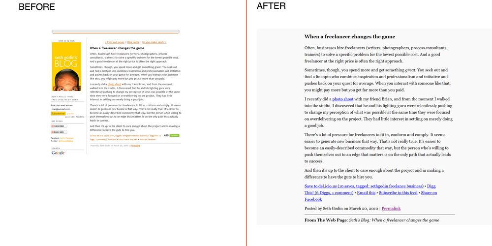
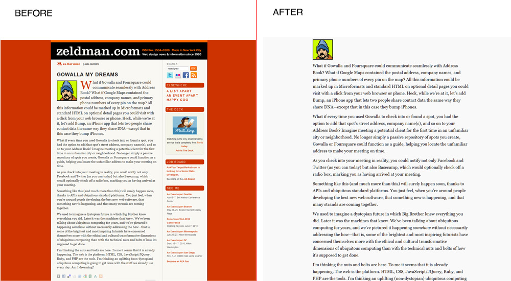
Friday, August 20, 2010 { 3 Comments }
My friend Mirko suggested me that it would be nice if I can extend my readability project ClipR for better Google Reader support . ClipR works well with Google Reader but is not very user-friendly because you must refresh the browser for every Google Reader article.So I decided to copy the typography from ClipR and to make completely new bookmarklet only for Google Reader.
So what basically GReadable does is expanding the article reading area inserting bigger more readable monitor optimized . You can learn more about the typography used on my previous post about ClipR typography .
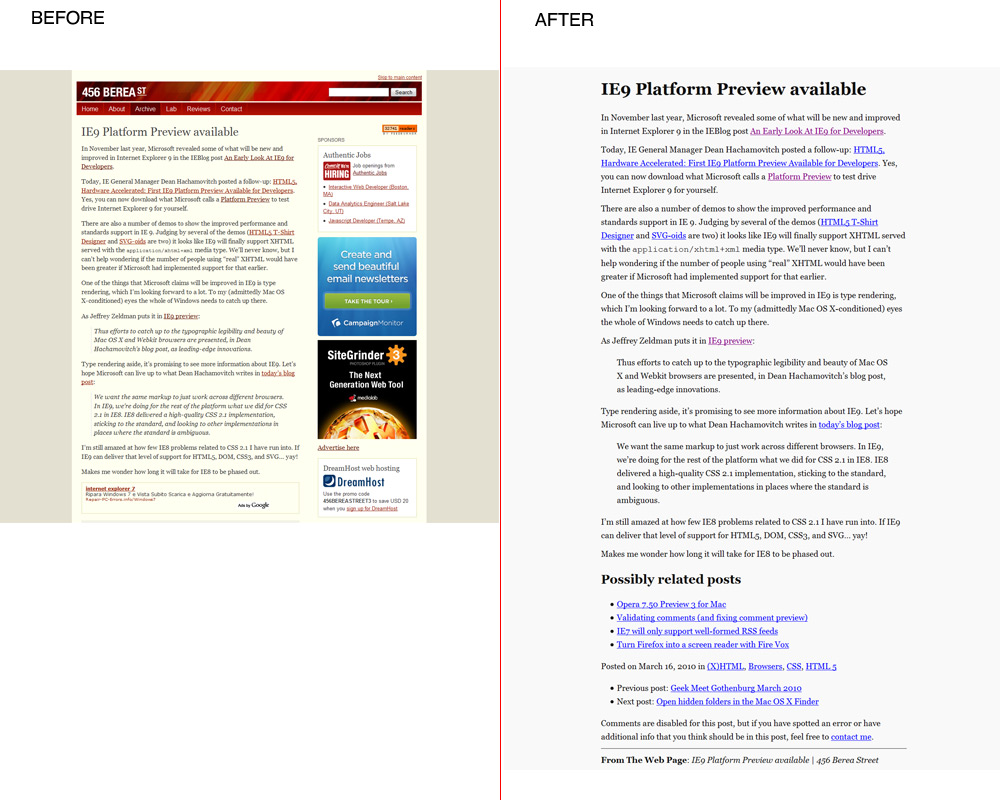
Here how the text will look like before and after inside Google Reader:
Before

After

The text example is taken from Smashing Magazine article The Web Design Community Offers Advice To Beginners
Here is the bookmarklet:
GReadable - Drag the link to your browser bookmark toolbar, then go to Google Reader page and click it.
All Google Reader articles will be modified and they will stay modified until you don’t exit or refresh Google Reader page.
I also made greasemonkey script install it here.
I will appreciate your thoughts and suggestions. Please comment.
TweetThisPage - bookmarklet for fast twitter posting
Friday, August 13, 2010 { 1 Comments }
Yesterday Twitter introduced the official (Tweet) Button and new API.I was eager to try the new API and I build right away new Bookmarklet who can help you fast posting to Twitter from any web page.
How this works?
Install the bookmarklet
TweetThisPage - Drag the link to your browser bookmark toolbar
When you click the bookmarklet it will automatically open new browser window and put the page HTML Title and the link (the link will get shorten by official Twitter shortener) . If you select any text from the page it will insert the selected page and avoid inserting the HTML Title.
And that is it.
When should you use it?
When the web page or the blog doesn’t have tweet button and you want to avoid copy pasting the title and url.
Here are some screenshots, I used Daring Fireball blog like an example:
With no text selected:

With text selected:

Here is also the source code from the bookmarklet:
(function () {

var l,t,s,D = document;
l = encodeURIComponent(location.href);
t = encodeURIComponent(D.title);
s = encodeURIComponent(D.getSelection());

if(s.length != 0)
{window.open('http://twitter.com/share?text='+s+'&url='+l,'', 'width=533,height=232,toolbar=1,resizable=0'); }
else
{window.open('http://twitter.com/share?text='+t+'&url='+l, '', 'width=533,height=232,toolbar=1,resizable=0'); }

})()
You don’t know what bookmarklet is here is Wikipedia link.
I hope that you will find this tool useful.
Bulletproof CSS3 media queries
Tuesday, July 20, 2010 { 14 Comments }
If you are part of the CSS community you probably know that CSS3 media queries will change the way how we write CSS.Why is that?
CSS3 media queries are very handy to target various devices with various monitor (screen) size. With the help of the CSS3 media queries we can have site optimized for iPhone and other mobile devices, with the same solution we can have site optimized for iPad and all other tablets . This CSS solution will be much more cheaper than building new mobile web site something like http://m.somewebsite.com or http://ipad.somewebsite.com .
Can we start using the CSS3 media queries today?
Yes we can!
The main problem of the CSS3 media queries is they will not work in the older browsers .
CSS3 media queries will not work in IE8 (and lower) also browsers lower then Firefox 3.5, Safari 3, and Opera 7. Basically the main problem is IE and the older version of Firefox.
For the mobile web browsers this solution should work for the modern webkit and opera browsers that support CSS3 media queries.
I tried to resolve this problem by providing pure CSS solution for 95% of market share PC browsers and JavaScript solution for the rest of the browsers.
Here is the solution:
<!-- Big screen -->
<link rel="stylesheet" type="text/css" href="CSS/main.css" media="screen and (min-device-width: 800px)" />
<!-- Tablet pc -->
<link rel="stylesheet" type="text/css" href="CSS/tablet.css" media="screen and (min-device-width: 481px) and (max-device-width: 799px)" />
<!-- Mobile -->
<link rel="stylesheet" type="text/css" href="CSS/mobile.css" media="only screen and (max-device-width: 480px)" />
<!-- If is lower than IE9 use conditional comments -->
<!--[if lt IE 9]>
<link rel="stylesheet" type="text/css" href="CSS/main.css" media="all" />
And the JavaScript solution for Firefox:
<script type="text/javascript">
if (/Firefox[\/\s](\d+\.\d+)/.test(navigator.userAgent)){
var ffversion=new Number(RegExp.$1);
if (ffversion<=3.5){
var headID = document.getElementsByTagName("head")[0];
var cssNode = document.createElement('link');
cssNode.type = 'text/css';
cssNode.rel = 'stylesheet';
cssNode.href = 'CSSNEW/main.css';
cssNode.media = 'screen';
headID.appendChild(cssNode);
}
}
</script>
We have one CSS for mobile browsers with max screen of 480px. For the older phones who doesn’t support CSS3 media queries we can alternately add media="handheld" CSS.
For the monitor size from 481px to 799px (iPad and other tablets) we will have other CSS.
In the case of the monitors from 800px and more we will have the main CSS.
All current IE browsers don’t support media queries but we can easily fix this by using IE Conditional Comments
For the older version Firefox we can use JavaScript
Probably very few people use Opera6 and Safari2 so I didn’t provide any solution. Alternately can be added JavaScript solution.
This CSS + JavaScript solution should work at 99% of all PC browsers and on newer Opera and Webkit mobile browsers.
Other important thing the browsers will probably download only one ( <link type="text/css" … /> ) stylesheet and ignore all the other CSS. In this way the browser will not load unnecessary CSS.
I’m not 100% sure that all the browsers will ignore the unnecessary CSS probably the browser speed experts like Steve Souders and Stoyan Stefanov may know little more about this.
Demo of this solution
Download the code
Conclusion: CSS3 Media Queries are cheap and easy way to optimize your web site for various devices. With this solution you can safely cover 99% of PC browsers and the modern mobile browsers (iPhone, iPad, Android, new webkit BlackBerry and the new Opera Browsers).
Other useful resources:
- Responsive Web Design
- CSS3 Media Queries
- CSS Media Queries & Using Available Space
- Media queries
- Eric Meyer at An Event Apart [PIC]
- How To Use CSS3 Media Queries To Create a Mobile Version of Your Website
- W3C Media Queries
Distributed Color Palette – Photoshop Tool
Monday, June 28, 2010 { 2 Comments }
There are many color palette tools that can help you choose colors for your web site or project.Usually all color tools generate or combine colors in equal quantity proportions, but in one web site, magazine or anywhere else the color is not distributed in equal proportion.
I wanted to make a color tool who can do better job in simulation of color quantity distribution.
I used photoshop shapes and layers to build circle based color system. You can easily customize it by duplicating and adding extra layers and colors.

Here is demo example for vimeo.com

>> Download the photoshop tool
iPhone Grid System
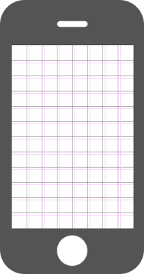
Tuesday, June 01, 2010 { 11 Comments }
Like a many developers and designers I was tempted to start building application for iPhone and for mobile devices in general. Beside the problem of choosing the programming language native Objective-C or Javascript + HTML5 was the problem of creating design environment for more easily pre application development and prototyping.I’m a fan of the grid design. Grids can help you understand the design space better, and they usually bring order and the balance to the design process and there are great help in the prototyping stage.
I was inspired with the Massimo Vignelli’s Unigrid System and I wanted to the similar thing with the iPhone.
So the problem was how to organize the 480px X 320px iPhone working space.
I decided to build 12:8 (480:320) Modular Grid System with the unit of 40px and the gutter of 5px.
I think that 12:8 grid system is a right balance for the iPhone, 24:16 will be probably too much and 6:4 too little.
For the calculating the gutter I first divided 320/8 = 40 and than 40/8 = 5px. For the gutter there is no right and wrong size it all depends what the grid will hold and what you want to achieve with the grid. So please feel free to change the gutter size or not to use it.
I made three version of the grid the first the grid only the second the grid and the iPhone frame and the last version The Grid + iPhone Frame + Notes with bought .PNG and photoshop .PSD files.
The iPhone Grid
iPhone Grid + Frame
iPhone Grid + Frame + Notes

Download - all files Photoshop Template .PSD and .PNG
.PSD iPhone Template can be easily personalized, feel free to change anything.
I hope that this grid system can help you in your next iPhone application or site development. If you want to learn more about the Grid Design this site is great place to start The Grid System
Any comments?
P.S If you are fan of paper prototyping you one of my previous post useful Sketchbook for web designers
CSS Mini Reset
Thursday, May 20, 2010 { 25 Comments }
What is CSS Reset?CSS Reset usually aims to reduce browser inconsistencies by evening up the CSS default settings in all browsers.
The most used CSS Rests are
Last week I spotted "CSS Reset – a simpler option" by Russ Weakley.
Russ made few smart observations: we don’t always need complete CSS reset because CSS Reset file can become very large and we often forget to set all the styles.
Also in my opinion we don’t always use all the CSS and HTML tags, when was the last time when you used “address” tag?
In many cases the complete CSS Reset makes perfect sense like in the case of some CSS Framework.
I used Eric Meyer Reset for my CSS Framework (Emastic and The Golden Grid).
In other my project complete CSS reset doesn’t make sense (Malo, Formy, 1 line CSS Framework).
My point is different projects(sites) can be approached differently, and not always we need complete CSS reset.
I wanted to make Mini CSS Reset who will focus on the main CSS features like Divs , Tables and Forms who are also the most used CSS(HTML) elements.
And here is the result:
/* CSS Mini Reset */

html, body, div, form, fieldset, legend, label
{
 margin: 0;
 padding: 0;
}

table
{
 border-collapse: collapse;
 border-spacing: 0;
}

th, td
{
 text-align: left;
 vertical-align: top;
}

h1, h2, h3, h4, h5, h6, th, td, caption { font-weight:normal; }

img { border: 0; }
You can compare:
You can use CSS Mini Reset when you actually don’t want to reset everything just the fundamental HTML elements.
Fork - Download CSS Mini Reset on github
Any suggestions?
CSS vendor prefixes – Can we all get along
Wednesday, May 05, 2010 { 16 Comments }
Last week I published CSS3 Action Library here is one part of the CSS code:
.h-scale:hover {
 -webkit-transform: scale(1.5); //For Safari and Chrome
 -moz-transform: scale(1.5);  // For Firefox
 -o-transform: scale(1.5); // For Opera
 transform: scale(1.5); // For some unknown future
}Thank god we have only few mainstream browsers. Otherwise this example should be much more longer.
I think that we didn’t learn the lesson from the past . We fight for years with Microsoft to respect the web standards. With IE8/9 great progress was made and Microsoft is finally going in right direction.
But today we have bigger problem than IE. We don’t have finished CSS3 spec.
In the absence of standards all browsers are guessing what should they implement. Every browser wants to be first to implement some new cool CSS feature. The risk is that we will end up writing specific CSS code for every browser. Trust me we don’t want that!
So what can we do?
We can help the CSS3 working group by donating, joining the CSS3 discussion, suggesting new features, writing examples, writing and discussing about CSS3 ...
I think that if more people are involved directly or indirectly in the Decision Making better the result (product) will be.
In the meantime while waiting for the definitive CSS3 spec browsers can join forces and decide for one universal prefix.
What about –css3- prefix for all new CSS3 experimental stuff?
The example from above will look like this (less code) :
.h-scale:hover {
 -css3-transform: scale(1.5); // In experimental phase
 transform: scale(1.5); // When becomes accepted standard
}PPK suggested –beta prefix but I think –beta can be confusing( –beta of what CSS2,CSS3 or CSS4).
Actually I don’t care if it is –css3 or –beta or –something-else I just don’t want to write the same CSS code million times.
This is open call to all the browsers: Can you all decide for one prefix ? Pretty Please.
What do you think? Please, comment!
CSS3 Action Framework
Tuesday, April 27, 2010 { 3 Comments }
It all started when I wanted to do Google CSS3 redesign. The propose of that redesign was to use as much as possible CSS3. I wanted to maintain Google minimalistic style with little Apple flavor and Bing background style. Also to use only pure CSS and CSS3. And the result was:Example: Google CSS3 redesign
CSS3 is really powerful tool and many of the things that early were done with some JavaScript library now can be done with CSS3.
When I write CSS I usually extract all the best practices and try to make little library so in the next project I will not write the same code over and over again . Don't repeat yourself.
After the Google CSS3 experiment I decided to spend little more time and make little CSS3 action library(framework).
The library is based on :hover, :active and :target and mainly on CSS3 transforms.
Here are some examples:
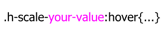
About the code syntax
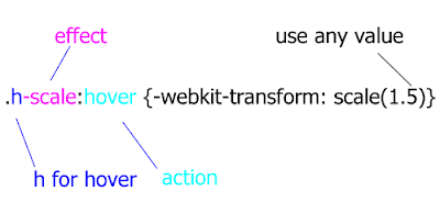
If you have multiple .h-scale values you can personalize your values.
How the system works?
About :hover(mouse over) and : active(mouse click) is very easy to understand. The HTML element will perform some action(scale, rotate, hide ..) on mouse over or mouse click.
Example:
This div will scale on mouse over and rotate on mouse click
<div class=" h-scale a-rotate ">…. </div>Example:
The click of the link will trigger scale event on the image. Everything is possible because of href=”#a” calls id=”a” of the image.
But the best way to learn is to play around with the CSS file and the examples. The code will work mainly in latest version of Firefox , Chrome, Safari and Opera. The cool thing is that even if this CSS doesn’t work in some browsers(mainly IE) the page will look exactly the same, obviously all the events will be off in the older browsers.<a href=”#a”>Some link</a>
<img id=”a” class=”t-scale” src=”” />
Please feel free to add more functionality to this library, new events, new features extended browser support ( I was lazy to optimize for IE8 and lover), change or extend the naming system if you don’t like my naming conventions.
I hope that this project can help you understand some of the new CSS3 features. Principally is made for teaching purpose but can also used in production.
This project is hosted on Google Code
Download the code & examples
I will leave you with this thought: CSS3 is powerful make up tool, do you want to look pretty?
Minimalistic Wallpaper for iPad
Tuesday, April 13, 2010 { 1 Comments }
This two weeks seams the whole world talk about one thing iPAd. So if you can't beat them join them. I feel that I’ve been brainwashed by this iPad thing :)I decided to build wallpaper for the iPad. I’m not sure why I did it, iPad is not even arrived in Italy. I’m not sure that I’m going to buy it but I wanted to create my own iPad wallpaper.
I wanted to be book like and simple and to contain the golden proportion(I’m little obsessed about the golden proportion lately)
So here is the result (768px X 1024px 132dpi)
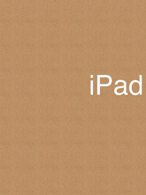
I used Helvetica like a font and white color to make contrast with the iPad black frame.
Here is how I used the golden proportions:
Enjoy
Photoshop glyphs tester
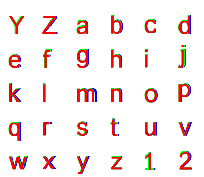
Thursday, April 08, 2010 { 4 Comments }
Three different project inspired me to this Photoshop tool.Arial versus Helvetica, GLYPHS Palette petition by @ilovetypography and Web Font Specimen by Tim Brown
I needed a tool who can visualize and compare basic glyphs from the English Alphabet and can be easily extendible.
I didn’t find any tool on the market for comparing different fonts. So decided to build one. Photoshop like a most used graphical tool seems to be a logical choice for this project. So that is why I used Photoshop instead of Illustrator. Photoshop is everywhere :)
Every letter(glyph) is a different layer in Photoshop and all the glyphs from the same font make one Photoshop group(by default can be Red, Green and Blue). Every group(and all the glyphs inside that group) is exactly above or below the other group so we have perfect mach of all the letters(glyphs).
You can easily select and change the font or color of all the letters inside one group so you can compare any font installed on your computer.
By default are three web safe sans serif fons groups R ( red color 144px Arial), G(green color 144px Tahoma )B(blue color 144px Verdana). Feel free to change the font add new group or glyph.
>> Download Photoshop glyphs tester
Hacker News mini Redesign [Unofficial]
Tuesday, March 30, 2010 { 2 Comments }
First why I decided to mini redesign Hacker News.Mainly because often happens to me to "got lost" between the links on the front page. I’m not sure if this is just my problem to not be able to spot a link even do I know that it is there. It is like whole link disappears for my visual field for few seconds. Maybe because my brain needs to filter 30 different links with different content.
So I tried to fix that problem. I started with the font . The font used on HN is Verdana.
Verdana is known to be readable font probably because of the extra space between the letters(and words). When I started like a programmer (not designer) there was one simple rule Verdana is readable and use it for everything. But now I spend couple of years studying typography and I realizing that is not that simple(And the ignorance is a bless, ha,ha).
So I played around with Hacker News page applying different safe web fonts. And I must say I’m particularly happy with big Georgia.
When Georgia is 12px is so small that losses all of its powers. And you can’t spot all the details of the glyph so usually all small serif fonts don’t work so well on monitor(screen). You can read more on my previous post.
But when Georgia is little bigger like 16px it becomes very readable. So I tried to use 16px for Hacker News and my first reaction was negative. I closed the page and reopen The second reaction – is not so bad and the third I’m starting to like it.
I decided to build a bookmarklet that transforms the Verdana to 16px Georgia, I’m using it since December and I’m quite happy with the results and the readability.
I changed the colors #1a1a1a for the title, #808080 for the clicked links and #f9f9f9 for the background.


Link to the page I inserted NoIndex Nofollow
And the second attempt was to use Hacking News Orange to do something #ff6600 so I did overlay(Photoshop) the previous color model and the results:


Link to the page I inserted NoIndex Nofollow
I implement the #341500 for the titles.
And that is it. This is just small redesign(font and color) and the structure of HTML is not changed.
The real redesign should take in concern many more factors.
I will make small list the things that can be changed on the front page:
No need for classical tables simple list(ul,ol) and little CSS can do the trick for the HN structure.
Give more importance to the comments ( I think that comments of HN are priceless I often receive more quality comments on HN than to my blog)
The size of the numbers 1-30 should be small as possible because they have no importance.
Also(I’m not sure) Different color for Ask HN questions.
Naturally when the front page is redesigned the design decision should be implemented to the rest of the site. I pretty happy with the current commenting system and I wouldn't change that.
That is it.
Help me test this theory.
Like I said before my first impact to Verdana to Georgia change was negative(I was like "what is this!"), than after a while I get used to Georgia and now I believe that Georgia version is much more readable . So my question is: Is it just me?
How can you test this theory?
You can use this bookmarklet who will change the current HN CSS and give you an idea of the real time redesign. So try to use it for one day and then comment if this change is influenced(improved or not) your readability on HN.
And the second thing that has nothing to do with this post or redesign. What you want to be changed in HN? Suggest some ides how HN can be improved.
And the last thing, pretty please be positive and approach this idea with creativity.
P.S This blog is using the typographical solution for my CSS Framework(Emastic) or 12px Arial and I’m little lazy to redesign it, eventually in my next redesign I’m planning to use bigger more readable font.
You can also comment at http://news.ycombinator.com/item?id=1229006
ClipR - bookmarklet for better internet reading
Wednesday, March 24, 2010 { 10 Comments }
ClipRead or ClipR is a tool(bookmarklet) who can help you read better on internet directly from your browser.
Before I will explain how this bookmarlet works here some screenshots.
Attention: All of the examples don’t have readability problems(actually are good example when you don’t need this bookmarklet). I just wanted to show you how this bookmarklet works.
I was inspired by Instapaper, Readability, Readable, Printliminator. Also I combined the web typography knowledge of my CSS projects (Azbuka, Better Readability Project, The Golden Grid, Emastic and Hartija) so the result is ClipR.
From: Seth's Blog
From: Jeffrey Zeldman Blog
From: 456 Berea Street
Go to the Download Page
Technical details: (For the people who know HTML, CSS and javascript)
The principle of ClipR is very simple it extracts only the content of(div and table) you select. So you read only the things you want everything else disappear from the page.
The main issue was how to resolve the typography in order to obtain better Readability.
I used the Golden Proportion and Fibonacci sequence (0,1,1,2,3,5,8,13,21,34,55,89,144...) to resolve some typographical issues.
I used Georgia like main font, In My Humble Opinion when Georgia is bigger than 16px provides excellent readability results.
For the font size I used 21px Georgia.
I increased the leading(line-height in CSS) from the standard(1.5) to (1.618 the golden proportion) also I decrease the distance by two paragraphs(13px).
The reading area of the page is 62% of the total page (62%:38% approximation the golden proportion).
Dark gray for the text(#111) and light gray(#f9f9f9) for the background.
For potential printing ClipR uses small part of Hartija – CSS Framework.
For the javascript part I used JQuery and Ben Alman Bookmarklet Generator.
One thing that strikes me over and over about JQuery it is that works even when it shouldn’t. I had the feeling that I’m not working with javascript. JQuery is just beautiful masterpiece.
ClipR is around 1kb end everything is inside the bookmarklet.
Only dependence of this bookmarklet is the Google Server where is hosted JQuery library http://ajax.googleapis.com/ajax/libs/jquery/1.4/jquery.min.js
This project is licensed under MIT license(so please feel free to personalize it)
Here is the source code and the explanation how to use the bookmarklet.
Direct link to the bookmarklet
Good reading!
About the 80 million dollars Blue (#0044cc)
Thursday, March 18, 2010 { 7 Comments }
Yesterday I find out about $80 million blue via Luke Wroblewski tweet . Naturally I got curies and watched Paul Ray video about the Bing redesign . Definitely interesting video and covers topics that I’m very fond of like Golden triangle and the reading process.But the most important part is blue of the links that brings Microsoft revenue of 80 million dollars.
From Paul Ray slides: (#0044cc) This blue is worth at least $80 million dollars.
I was little Wow, right now I’m working on my search engine and I know how difficult and important that decision. I’m also interested in color theory. So I was super curious about the holy grail of blue and how can affect our design decision in the future. So I opened Photoshop and Excel and run some tests.
And I was very surprised of my findings.
Before you go on with further reading do you want to take Red or Blue Pill :-)
First a little intro in colors and color theory. Like you know RGB is (Red, Green, Blue) and every color on our monitor is made by mixing this colors. The values of each color can go from 0 to 255. So in other words:
Red is mix of (Red:255, Green :0, Blue:0) or #ff0000
Green is mix of (Red:0, Green :255, Blue:0) or #00ff00
Blue is mix of (Red:0, Green :0, Blue:255) or #0000ff
This are pure colors.
And this is Bing Blue:
(Red:0, Green :68, Blue:204) or #0044cc
So mix of 68 Green and 204 Blue(1:3 proportion) = 80$ million dollars blue.
Cool 204/68 = 3 so this proportion makes perfect mathematical sense.
But something was troubling me with this number. In color theory the thing doesn’t work like that.
In order something to be complete red + green + blue should be 255.
But in this case we have (0 Red + 68 green +204blue = 272) And 272 <> 255.
I even made Excel experiment
So the right blue will be (0Red + 51green + 204 blue = 255) or #0033cc
So I tried to insert this new number directly in Bing with Firebug and I was surprised to find out there was no trace of #0044cc but the number for the links was #0033cc.
I was little flattered that I came out with this number all by myself.
But the question was Why someone on Mix presentation will present false number!!?
Than all suddenly all came clear to me! It is a mind puzzle!
I will explain everything in a sec.We have 204blue and 51green which is #0033cc the color used on Bing site for links.
204:51 = 4:1 = 80% :20% or 80%blue with 20% green.
This is 80/20 rule also know as Pareto principle is one of the basic rules in many areas and one of the key principles in design.
It is not 80 million of dollars but 80% of blue used #0033cc.
Is the 80 million just pure accident ? I know one turtle who will say There are no accidents ha,ha :).Anyway to get serious no matter what blue you will choose you will fail if you don’t balance the rest of the page. Is not just the blue but everything around who says that design is easy. The color theory is very challenging and powerful thing ,you can easy transmit a message to our subconscious mind. My compliments to Bing and Microsoft that finally started to invents seriously in design .
P.S
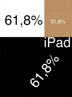
Here is my $618 million dollar blue (#00619e)
It is made by using the Golden Proportion (0Red : 97 Green : 158 Blue) or 38.2 percent Green and 61.8 percent Blue.Cheers!
Opera 10.50 for one week - Summary
Monday, March 15, 2010 { 25 Comments }
Last week I started an experiment to use Opera 10.50 like primary browser for week.Thank you all for the wonderful feedback and support.
Here are the results: Opera is really fast and fluid. And is real pleasure surfing the web.
If I need to define Opera with one word I would say: Opera is Linux. Why is that?
They bought have Scandinavian origins, both have small market share, passionate community support, Linux have problem with drivers Opera with plugins. Big companies have no interest developing drivers or plugins because of the small market share. So community developers must provide them.
And the final truth Opera is build from programmers to programmers.
So my slogan for Opera is "Opera from programmers to programmers".
Problems I encountered in Opera. Many advised me to use Opera 10.10 like more stabile version. This is probably true Opera 10.50 sometimes “forget” to render the page. Also RAM garbage collector is not fine tuned.
And the big issue the User Interface.
In Opera you can personalize everything and I have no problem with that. I have problem how you do that.
So I wont to dedicate this part of the post to express my Opinion on how I imagine Opera. I like to give my small contribute and help Opera improve.
First the plugins, because Opera small market share the developers prefer to build plugins for Firefox. So it will be wise Opera to build some tools for easy plugin development. So the developers can easy switch and build plugins for Opera.
I’m more fan of bookmarklets because they can work in every browser, but sometimes plugins can be very complex and can’t be replaced with bookmarklets.
The interface:
It can be pretty confusing. With the web we are used of the philosophy “Don’t make me think”. For me good interface is one who starts simple in the start but in the background you can personalize almost everything.
So I open Photoshop and tried to make my personalization of Opera. In other words mini redesign of Opera.
The main idea is when you start with Opera to have few things that you really need. Imagine some IE7 user who wants to try the new Opera browser because he heard that is fastest but with the first impression of Opera he is "dazed and confused" and he leaves Opera forever for IE8 maybe.
Keep it Simple and Don't Repeat Yourself

The default start
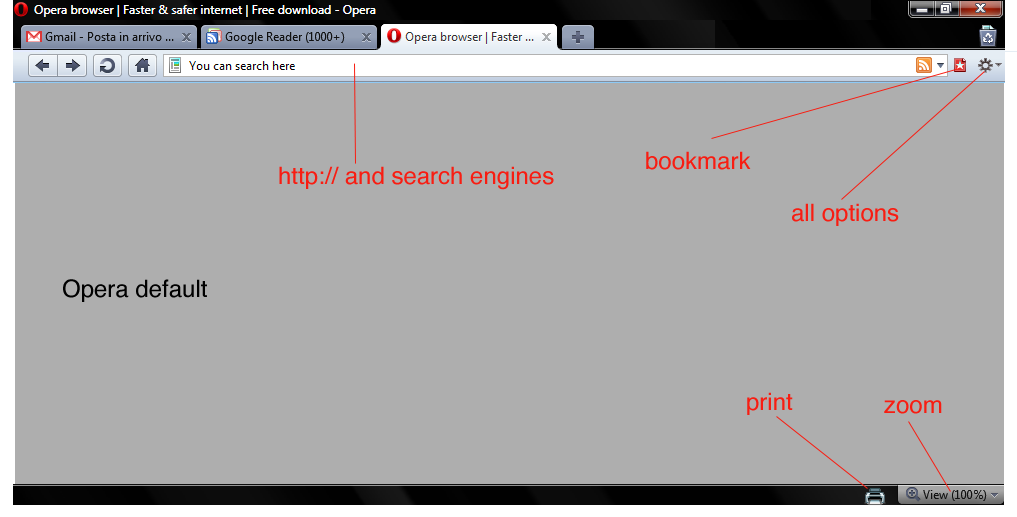
Opera with all the menus

Download the Photoshop file with the design
And this is it. I think there are many menus that actually nobody uses.
With the default settings of Opera you can navigate, search, zoom, print, bookmark. Nothing else.
If you need to configure Opera Turbo or Opera Unite go to the configuration options in the background options and configure it. If you are advanced user and you need to download torrents go to opera:config configure it.
So again "Keep it simple" for the normal user and leave all the complex stuff in background for advanced uses.
Dragonfly is cool. Specially for me like CSS guy Dragonfly is most important tool. Here are some ideas what can be added to Dragonfly. What about CSS redundancy checker? It could useful for many web designers. Also one thing that I can’t find anywhere, speed simulation directly from the browser. I think that Dragonfly need something exclusive and original in order to be used over Firebug.
Also I think can be handy to add some tools for Mobile development and testing directly from the web browser. I know that there are some online tools like Opera mini demo . But I think that having that tool inside the browser can be cool idea.
Few words about CSS3 - great job Opera CSS team. I really love the Opera strategy about CSS3. I will probably dedicate one post about this issue.
There are probably many other things that can be discussed and talk about but I will leave the comments for that.
Summary: Opera is fast and more important once the page is loaded the navigation is smooth and fluid.
Main issues are confusing UI and plug-in support that with little effort can be resolved. Opera is definitely going in right direction.
Will I continue to use Opera like my default browser? I don’t know. I’m plugin dependent I use plugins for everything (Twitter , Color, Seo, The Grid, Measurements, Spelling, Cookies all Social Network …) . Probably that is the only reason why I’m bonded with Firefox. So for normal browsing I will probably use Opera and for work Firefox.
Question I will you leave you with: What you love and hate about Opera? And what Opera should do to become better browser?
Initiative - Opera 10.50 for one week
Monday, March 08, 2010 { 50 Comments }
We people are very good in supporting initiate for killing things RIP IE6 but sometimes we fail to give support when something good and cool happens.Maybe you heard Opera 10.50 is out and is fastest browser in the world.
I’m passionate Firefox user mostly because of various developer plugins and simply because I used to use Firefox.
For me Opera was just test browser for testing my web sites, but often thought that Opera deserves more attention . I was always fascinated by the small Norwegian company that had always good browser but very often bad marketing strategy. Opera was not always free and if they relisted the free version when we had only IE and Netscape, Opera would probably had different market share today.
I want to call up one initiative: Opera 10.50 like your primary browser for one week.
So give Opera a chance. Test it. Use it.
Why to use Opera?
Fastest JavaScript engine - Carakan
CSS3 and HTML5 Support – (For me personally like CSS Framework builder this is most important part)
Opera has invested a lot in full support of CSS and HTML standards . In early days Opera had big issues with compatibility and standard. If I hate some browser more than IE6 it will probably be Opera 7.
But today among Opera staff we have Håkon Wium Lie the father of CSS, Molly Holzschlag , Bruce Lawson , David Storey , Chris Mills and probably many more that I don’t know.
This people are guarantee that Opera will follow the path of Web Standards and HTML5 and CSS3 implementation.
There are many other features that Opera provides, but for me personally is interesting is dragonfly ( It is like firebug for Opera). ). I will try to discover new plugins and addons this week.
I recently discovered Opera Widgets it is something like Adobe AIR but with less RAM consumption.
I also discovered that with Opera you can download torrents, I probably will never trade uTorrent for anything but it’s cool to know that you can actually download torrents with the browser.
Why I’m doing this experiment?
Probably because I want to try to survive one week without Firefox and the second thing I meet two Opera team members last year on one web conference(Molly and David) who ensure me that Opera is going in right direction.
Again. The experiment is use Opera 10.50 for one week like your primary browser. In this week try to find all good and bad stuff about Opera. Than is up to you if you continue with Opera or not.
Are you willing to try this experiment with me?
Update: Opera 10.50 for one week - Summary
Quark – mini php CMS
Monday, March 01, 2010 { 12 Comments }
Quark is probably the smallest Content Management System build with PHP. It’s actually build of one PHP function.It’s meant to help web designers to manage small web sites.
Why I build it?
I work mostly for one firm where we hand code everything. When we build web site we start from scratch. So we build the web site and the management behind the site for our clients, often the management behind the site is more complex then the web site itself. For every site the programming and web logic is different. That is why we need a lot of time to build everything, result we are expensive.
In order to be more competitive for the clients with the less budget we tried to use Joomla. We get very enthusiastic at the beginning specially the part where we don’t have to develop the admin part. But after two years we realize that the time for developing is almost equal but we charge less. Other problems we pray that hackers don’t attack us, that component developers give continuous support and the critical point how you debug 3000 – 5000 file monster. I repeat 3000 php files for one web site … WTF!? Don’t get me started about the quality of HTML , CSS and quality of major of Joomla templates.
So I tried to try to resolve the problem, first I tried to build system that will be able to automatically manage any MySQL database by creating MySql Lite Administrator. Only thing is you need primary key in the tables . Everything else is automatic.
Then I wanted to build CMS for the front, but I didn’t had time and I right “philosophic” ideas how complex should be the system . Then I sow CushyCMS and liked the simplicity but didn’t like that you should change the CSS logic in order to work. Then I saw the video on Drew McLellan's - Perch and I sad this is it! This is the principle that I was looking. So I decided to start from Perch idea and build something damn simple.
So I did it, one PHP function and one MySQL table. And this is it. I name it Quark after the Quark particle . A quark is an elementary particle and a fundamental constituent of matter.
The principle is simple you replace text or html with . So you can put plain text or html for links, images, link list and many more.
If you have very simple site and you want to edit few things like menu, some text this is right solution . I think with little creativity you can make a lot of stuff. The main point to this project is to add dynamic parts to your static small site. So you can build static HTML + CSS site and then make editable some parts like menu, text, links, images est.
Quark does not mange forms so you can’t use it like blog platform. Quark is not meant to replace big CMS like Joomla and Drupal.
And for the management of the DB you can use MySql Lite Administrator or build your own managing system.
If you need to manage forms, resize images ,multilingual support you can purchase Perch or some other small CMS.
Some technical details: Like I said before Quark is made of one php function and MySQL table. You can use PHP4 or PHP5. The php function is extremely simple to understand so everyone with little knowledge of PHP can understand it. My goal was to make very fast MySQL interrogation I was experimenting mainly with mysql_fetch_array and mysql_fetch_row and the results are there are no notable differences.
I tried to run 25 calls(20kb each) to database with total amount of 55.000 words or 85 word document pages with Lorem ipsum text time of execution 0.1 seconds and 0.09 MB Ram. My point is this thing is quick even if you have large amount of data.
How to use it?
There are three columns inside the DB table called quark_table one columns is content and another called name_tag.
| id | content | name_tag |
|---|---|---|
| Put any content inside lorem ipsum, HTML .. | ipsum | |
| 2 | Any HTML or text | any_name_you_like |
So inside HTML you can call the or .
Important to remember that you can choose any name you like so you have absolute freedom of naming your tags. The names should be unique.
And that is it.
When to use it?
Imagine that you have 10 page pure HTML + CSS site the client ask you to add one extra page on the site and to put one link that that will lead to the new page. If you have the same link structure in all 10 pages you will probably go page to page and change manually all the pages.
Or with Quark you will make something like and change it just once.
Same goes for all the repeating multiple parts of your static HTML like header, footer obviously depending on your site architecture.
Download:
Download Quark +DB Structure + Demo
For managing MySQL table you can use MySql Lite Administrator
Disclaimer: I wasn’t sure how to call this project Is it CMS, Is it PHP Template engine or just one simple nifty php function. In some way this project Manages the Content so Content Management System it is.
The Golden Grid PSD Template
Wednesday, February 10, 2010 { 7 Comments }
If Emastic is my technically preferred CSS Framework The Golden Grid is my elegant pride and joy.Recently I stumbled upon this Blog post that gives free PSD Template for The Golden Grid. Elegant and simple 20kb zip solution. I’m always super happy when I see that people are contributing and sharing things . Thank you Altzgamer.
I also had some unfinished PSD Template for The Golden Grid . I find some free time to complete it.
There it is:

You will find all the grids and recommended image ratio.
If you are not familiar to The Golden Grid here are some thing that this CSS Framework offers:
- Simple naming system
- You can build hundreds of grid variations
- The CSS grid is less than 1kb (compressed)
- Custom based typography
- Works in older browsers
WikiReader – bookmarklet for Wikipedia reading
Thursday, February 04, 2010 { 2 Comments }
Probably there is no day that I don’t consult Wikipedia site. I think that we all frequently visit Wikipedia site and enjoy reading its content.I wanted to create Kindle like reading experience for Wikipedia reading directly from your browser.
There are already two great bookmarklets who are doing great job at this Readability and Readable. The problem is they are optimized for every site not for Wikipedia.
So I liked to build Wikipedia only reader.
Here is an example.
Wikipedia before:

After:

How I did the bookmarklet?
I took Wikipedia CSS file for web printing and I made some changes and then I used this tool to make the bookmarklet . Pretty easy :)
What I changed inside print CSS style?
Bigger font. Black for the text. Gray for the links. Serif. Georgia. Bigger leading.
With few words Big Georgia font probably means super readable text.
I don’t want to bother with my design decision or typography decision if you want to find more about opinion about web typography browse these articles:
Serif vs. sans-serif legibility
How we read on web and how can we improve that
Azbuka - CSS Typographical Base Rendering Library
>> DOWNLOAD WikiReader bookmarklet <<
(Works in Firefox and Chrome in Safari 4.04 brakes for some reason does not work for IE)
How to use the bookmarklet? It is super easy after you Drag & Drop the link to your browser bookmark toolbar go to some Wikipedia article and click the button(bookmark).
If you still don't know what is bookmarklet and how they work here is Wikipedia article about bookmarklets.
Enjoy your Wikipedia reading.


About Me <<<
Name: Vladimir Carrer
vladocar [at] gmail.com
Location: Verona, Italy
I'm a web designer, developer, teacher, speaker, generally web addicted ...
My projects <<<
- AI Prompt Directory
- Hand Drawn Icons
- Font Design Inspiration
- Font Pairings
- Free SVG Cut File
- Upcoming NFT projects
- Discord Tutorials
- Free Sublimation Designs
- Tech Feed
- MySQL Lite Administrator
- Quark Mini PHP CMS
- Formy - CSS Form Framework
- Emastic - CSS Framework
- Malo - CSS Library
- The Golden Grid
- 1 line CSS Grid Framework
- Two Lines CSS Framework
- Child Selector System - CSS Framework
- Better Web Readability Project
- Azbuka - CSS Typographical Base Rendering Library
- ClipR - bookmarklet for better reading
- CSS3 Action Framework
- CSS Mini Reset
- HTML5 Mini Template
- CSS Mobile Reset
- picoCSS - JavaScript Framework
- HTML Lorem Ipsum Crash Test
- Object Auto Documentation - JavaScript
- o - JS Library for Object Manipulation
- Foxy - CSS Framework
- Tumblr Free Theme - Better Readability Project
- Box - CSS Framework
- SMART CSS GRID
- nanoJS - Minimal JS DOM Library
- Flexy CSS Framework
- Katana is CSS Layout System made with Flexbox
- Micro CSS Reset
- 60 Grid System
- Simple CSS Button
- ramd.js JavaScript library for making web applications.
- Minimal Notes web app build with Vue.js
- Scribble Font for Prototyping & Wireframing
- Flex One - 1 CSS Class System
- Floaty - CSS Float Based Layout System
- Infinity CSS Grid
- CLI Convert websites into readable PDFs
- keywords-extract - CLI tool, extract keywords from any web page.
- screenshoteer - Make website screenshots and mobile emulations from the command line.
- Basic.css - Classless CSS Starter File
§§Previous Posts <<<
- GPT-3 and CSS Frameworks
- Don’t use CSS Reset use CSS Set
- One Page 2020 Calendar Print Version
- 3 CLI tools based on Node.js
- Scribble Font for Prototyping & Wireframing
- ramd.js - Small JavaScript library for making TODO...
- Katana.scss - CSS Layout System made with Flexbox
- Flexy CSS Framework
- nanoJS - JavaScript for DOM manipulation
- SMART CSS GRID
§Archives <<<
- May 2006
- June 2006
- July 2006
- August 2006
- September 2006
- October 2006
- January 2007
- February 2007
- October 2007
- April 2008
- June 2008
- July 2008
- August 2008
- September 2008
- November 2008
- December 2008
- January 2009
- February 2009
- March 2009
- April 2009
- May 2009
- June 2009
- August 2009
- September 2009
- October 2009
- November 2009
- December 2009
- January 2010
- February 2010
- March 2010
- April 2010
- May 2010
- June 2010
- July 2010
- August 2010
- September 2010
- October 2010
- November 2010
- December 2010
- January 2011
- February 2011
- March 2011
- April 2011
- May 2011
- June 2011
- July 2011
- August 2011
- September 2011
- October 2011
- November 2011
- December 2011
- January 2012
- February 2012
- March 2012
- April 2012
- June 2012
- August 2012
- November 2012
- January 2013
- March 2013
- June 2013
- October 2013
- November 2013
- March 2014
- September 2014
- October 2014
- November 2015
- March 2018
- May 2018
- June 2018
- July 2018
- October 2018
- January 2019
- January 2020
- June 2020
- April 2021
Other Profiles <<<

Content is licensed under a Creative Commons Public Domain License