{Carrer web log} ←
Serif vs. sans-serif legibility
Tuesday, October 27, 2009 { 9 Comments }
Probably one of everlasting discussion is legibility issue of serif and sans-serif fonts.So I made some experiments in order to clarify the issue.
First thing I tried Jost Hochuli theory that we need only upper half of the letter in order to understand the text.
What is this?

Can you recognize this four letters?
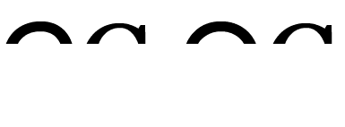
What about now?

Left to right ( C Arial, C Georgia, O Arial, C Georgia)
So we have the upper part of the letter C and O (sans-serif Arial) and there are looking exactly the same.
C and O(sans-serif Arial) have exactly the same shape.

Our eye will try to close the missing part of the letter C and make O or circle.
There is one beautiful article about this: Gestalt Principles of Perception - 5: Closure.
In the case of C serif the barb will prevent our eye for closing the full circle or O.
Conclusion: Our eye can read faster serif because the logical line stops and we can faster "close" and determine the shape.
Serif and sans-serif on monitor
There is general opinion that sans-serif work better on screen.That is probably because the monitors are displaying px so sans-serif look much cleaner. Serif fonts, specialy on low resolution monitors can look "noisy".

Can you notice the pixels in the right I letter?
In my opinion sans-serif give sense of order and clearness and display better on monitor, but clear and beautiful is not necessary readable.
Maybe the real question is do we prefer beautiful or readable.
Other interesting study( theory) was that we are fast reading Times New Roman because Times New Roman is everywhere specially in the newspapers and books.
In other words we are use to read Times New Roman and with time we get better and faster.
And probably the most important thing is the quality of the font. No matter if it is serif or sans-serif poorly designed font will give poor results.
Summary: A priori probably well designed serif fonts are more legible then well deigned sans-serif fonts. Then comes the experience factor, how often we read that particular type of font and how much we are use to it.
What do you think?
9 Responses to “Serif vs. sans-serif legibility”
-
//
 Andy
// 10/27/2009
Andy
// 10/27/2009
I do try to avoid serif fonts where ever possible really and that's certainly something that you learn from experience when you start web design.
There's nothing worse than seeing the supposedly beautify contours of a type face looking jagged which is what happens on low quality LCD screens.
I sometimes use a serif font for headlines if the job dictates a certain type of elegance, but never ever for the main body of text. -
//
 Vladimir
// 10/27/2009
Vladimir
// 10/27/2009
@Andy I completely agree about the "beauty" concept. If you can notice I'm using Serif for headlines and sans-serif for the text on this blog.
But in my opinion if we have quality monitors serif can be more legible.
Here is great example of good use of serif on screen http://informationarchitects.jp/zeit-online-by-ia/
Point of this article is not that sans-serif are bad serif are good.
It is just simple experiment to point why serif in general are more legible.
My problem was there are many articles and experiments saying that sans are more legible but no one explains why. So I tried to use the Gestalt Principles to try to support the theory of serif readability. -
// trrll
// 10/27/2009
You are certainly correct about the greater legibility of serif fonts. Still, sans-serif looks nice in many contexts.
However, Arial is particularly bad even for a sans-serif typeface, because it has almost no contrast between thicks and thins, as well as little variation in letter shapes. I find Optima far more legible than Arial without resorting to serifs, while Lucida provides a nice middle ground. Your "CC OC" example would be more distinguishable in either of those type faces. -
// Slartibartfarst
// 10/27/2009
-
//
// 10/28/2009
-
// Vladimir
// 10/28/2009
@Anonymous: Yes, this blog uses sans-serif for the text. Why? I prefer Arial the copy of Helvetica and think that Helvetica(Arial) are very beautiful. In my case I trade beauty for readability.
It is my personal chose for this blog even that I'm aware that bigger(like 16px) and serif fonts are generally more readable. -
// G F Mueden
// 10/28/2009
-
// OHaleck
// 10/28/2009
Arial is not a copy of Helvetica or opposite. Also, Times New Roman is not used everywhere (like in newspapers or books), though these are serif fonts. It's just a font that comes with the OS installed on 90% of computers worldwide. I wonder, why you used Georgia for the readability comparison. It is much prettier a little bit easier to read than TNR. Documents look much better and cleaner written in Georgia, than with Times New Roman.
-
// peterm_aus
// 11/17/2009
Gee some of you guys either use very big letters in your web pages (you can see pixels on the edge of serifs, really?) or you have eyes like hawks. Meanwhile, the rest of us humans just see the serif, and move on. And in the meantime, legibility or readability (of letters, words) is one thing, but reader comprehension of the whole text is what most of us aim for.
If I want to train a speed reader, I might test for speed of recognition. Usually I don't want to: I just want to get a point across. So when the studies come out on how readers understand text with body sans serif fonts, I'm interested. At present, the only ones I've seen comparing body font choices for comprehension are old ones saying serifs work miles better. Google Colin Wheildon.
<< Home


About Me <<<
Name: Vladimir Carrer
vladocar [at] gmail.com
Location: Verona, Italy
I'm a web designer, developer, teacher, speaker, generally web addicted ...
My projects <<<
- AI Prompt Directory
- Hand Drawn Icons
- Font Design Inspiration
- Font Pairings
- Free SVG Cut File
- Upcoming NFT projects
- Discord Tutorials
- Free Sublimation Designs
- Tech Feed
- MySQL Lite Administrator
- Quark Mini PHP CMS
- Formy - CSS Form Framework
- Emastic - CSS Framework
- Malo - CSS Library
- The Golden Grid
- 1 line CSS Grid Framework
- Two Lines CSS Framework
- Child Selector System - CSS Framework
- Better Web Readability Project
- Azbuka - CSS Typographical Base Rendering Library
- ClipR - bookmarklet for better reading
- CSS3 Action Framework
- CSS Mini Reset
- HTML5 Mini Template
- CSS Mobile Reset
- picoCSS - JavaScript Framework
- HTML Lorem Ipsum Crash Test
- Object Auto Documentation - JavaScript
- o - JS Library for Object Manipulation
- Foxy - CSS Framework
- Tumblr Free Theme - Better Readability Project
- Box - CSS Framework
- SMART CSS GRID
- nanoJS - Minimal JS DOM Library
- Flexy CSS Framework
- Katana is CSS Layout System made with Flexbox
- Micro CSS Reset
- 60 Grid System
- Simple CSS Button
- ramd.js JavaScript library for making web applications.
- Minimal Notes web app build with Vue.js
- Scribble Font for Prototyping & Wireframing
- Flex One - 1 CSS Class System
- Floaty - CSS Float Based Layout System
- Infinity CSS Grid
- CLI Convert websites into readable PDFs
- keywords-extract - CLI tool, extract keywords from any web page.
- screenshoteer - Make website screenshots and mobile emulations from the command line.
- Basic.css - Classless CSS Starter File
§§Previous Posts <<<
- CSS Specificity Coding Method
- Designing typographical wallpapers for iPhone
- CSS Specificity - Cheat Sheet
- Blog prototyping with Emastic using the Golden Pro...
- 4 useful Bookmarklet for Twitter, Google, CSS, SEO
- Twitter Unofficial Redesign
- Integration of Better Web Readability Project with...
- 1 line CSS Grid Framework
- O rule + golden proportion for calculating the gut...
- How we read on web and how can we improve that

Other Profiles <<<

Content is licensed under a Creative Commons Public Domain License