{Carrer web log}
Hacker News mini Redesign [Unofficial]
Tuesday, March 30, 2010 { 2 Comments }
First why I decided to mini redesign Hacker News.Mainly because often happens to me to "got lost" between the links on the front page. I’m not sure if this is just my problem to not be able to spot a link even do I know that it is there. It is like whole link disappears for my visual field for few seconds. Maybe because my brain needs to filter 30 different links with different content.
So I tried to fix that problem. I started with the font . The font used on HN is Verdana.
Verdana is known to be readable font probably because of the extra space between the letters(and words). When I started like a programmer (not designer) there was one simple rule Verdana is readable and use it for everything. But now I spend couple of years studying typography and I realizing that is not that simple(And the ignorance is a bless, ha,ha).
So I played around with Hacker News page applying different safe web fonts. And I must say I’m particularly happy with big Georgia.
When Georgia is 12px is so small that losses all of its powers. And you can’t spot all the details of the glyph so usually all small serif fonts don’t work so well on monitor(screen). You can read more on my previous post.
But when Georgia is little bigger like 16px it becomes very readable. So I tried to use 16px for Hacker News and my first reaction was negative. I closed the page and reopen The second reaction – is not so bad and the third I’m starting to like it.
I decided to build a bookmarklet that transforms the Verdana to 16px Georgia, I’m using it since December and I’m quite happy with the results and the readability.
I changed the colors #1a1a1a for the title, #808080 for the clicked links and #f9f9f9 for the background.


Link to the page I inserted NoIndex Nofollow
And the second attempt was to use Hacking News Orange to do something #ff6600 so I did overlay(Photoshop) the previous color model and the results:


Link to the page I inserted NoIndex Nofollow
I implement the #341500 for the titles.
And that is it. This is just small redesign(font and color) and the structure of HTML is not changed.
The real redesign should take in concern many more factors.
I will make small list the things that can be changed on the front page:
No need for classical tables simple list(ul,ol) and little CSS can do the trick for the HN structure.
Give more importance to the comments ( I think that comments of HN are priceless I often receive more quality comments on HN than to my blog)
The size of the numbers 1-30 should be small as possible because they have no importance.
Also(I’m not sure) Different color for Ask HN questions.
Naturally when the front page is redesigned the design decision should be implemented to the rest of the site. I pretty happy with the current commenting system and I wouldn't change that.
That is it.
Help me test this theory.
Like I said before my first impact to Verdana to Georgia change was negative(I was like "what is this!"), than after a while I get used to Georgia and now I believe that Georgia version is much more readable . So my question is: Is it just me?
How can you test this theory?
You can use this bookmarklet who will change the current HN CSS and give you an idea of the real time redesign. So try to use it for one day and then comment if this change is influenced(improved or not) your readability on HN.
And the second thing that has nothing to do with this post or redesign. What you want to be changed in HN? Suggest some ides how HN can be improved.
And the last thing, pretty please be positive and approach this idea with creativity.
P.S This blog is using the typographical solution for my CSS Framework(Emastic) or 12px Arial and I’m little lazy to redesign it, eventually in my next redesign I’m planning to use bigger more readable font.
You can also comment at http://news.ycombinator.com/item?id=1229006
ClipR - bookmarklet for better internet reading
Wednesday, March 24, 2010 { 10 Comments }
ClipRead or ClipR is a tool(bookmarklet) who can help you read better on internet directly from your browser.
Before I will explain how this bookmarlet works here some screenshots.
Attention: All of the examples don’t have readability problems(actually are good example when you don’t need this bookmarklet). I just wanted to show you how this bookmarklet works.
I was inspired by Instapaper, Readability, Readable, Printliminator. Also I combined the web typography knowledge of my CSS projects (Azbuka, Better Readability Project, The Golden Grid, Emastic and Hartija) so the result is ClipR.
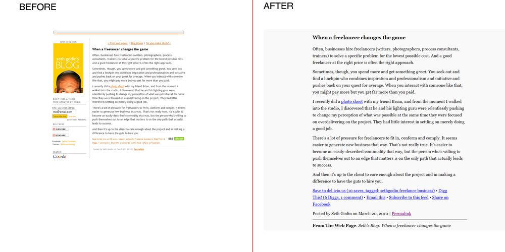
From: Seth's Blog
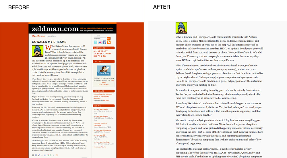
From: Jeffrey Zeldman Blog
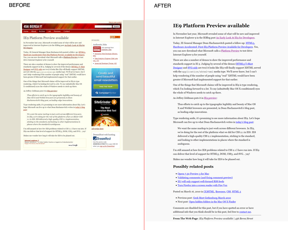
From: 456 Berea Street
Go to the Download Page
Technical details: (For the people who know HTML, CSS and javascript)
The principle of ClipR is very simple it extracts only the content of(div and table) you select. So you read only the things you want everything else disappear from the page.
The main issue was how to resolve the typography in order to obtain better Readability.
I used the Golden Proportion and Fibonacci sequence (0,1,1,2,3,5,8,13,21,34,55,89,144...) to resolve some typographical issues.
I used Georgia like main font, In My Humble Opinion when Georgia is bigger than 16px provides excellent readability results.
For the font size I used 21px Georgia.
I increased the leading(line-height in CSS) from the standard(1.5) to (1.618 the golden proportion) also I decrease the distance by two paragraphs(13px).
The reading area of the page is 62% of the total page (62%:38% approximation the golden proportion).
Dark gray for the text(#111) and light gray(#f9f9f9) for the background.
For potential printing ClipR uses small part of Hartija – CSS Framework.
For the javascript part I used JQuery and Ben Alman Bookmarklet Generator.
One thing that strikes me over and over about JQuery it is that works even when it shouldn’t. I had the feeling that I’m not working with javascript. JQuery is just beautiful masterpiece.
ClipR is around 1kb end everything is inside the bookmarklet.
Only dependence of this bookmarklet is the Google Server where is hosted JQuery library http://ajax.googleapis.com/ajax/libs/jquery/1.4/jquery.min.js
This project is licensed under MIT license(so please feel free to personalize it)
Here is the source code and the explanation how to use the bookmarklet.
Direct link to the bookmarklet
Good reading!
About the 80 million dollars Blue (#0044cc)
Thursday, March 18, 2010 { 7 Comments }
Yesterday I find out about $80 million blue via Luke Wroblewski tweet . Naturally I got curies and watched Paul Ray video about the Bing redesign . Definitely interesting video and covers topics that I’m very fond of like Golden triangle and the reading process.But the most important part is blue of the links that brings Microsoft revenue of 80 million dollars.
From Paul Ray slides: (#0044cc) This blue is worth at least $80 million dollars.
I was little Wow, right now I’m working on my search engine and I know how difficult and important that decision. I’m also interested in color theory. So I was super curious about the holy grail of blue and how can affect our design decision in the future. So I opened Photoshop and Excel and run some tests.
And I was very surprised of my findings.
Before you go on with further reading do you want to take Red or Blue Pill :-)
First a little intro in colors and color theory. Like you know RGB is (Red, Green, Blue) and every color on our monitor is made by mixing this colors. The values of each color can go from 0 to 255. So in other words:
Red is mix of (Red:255, Green :0, Blue:0) or #ff0000
Green is mix of (Red:0, Green :255, Blue:0) or #00ff00
Blue is mix of (Red:0, Green :0, Blue:255) or #0000ff
This are pure colors.
And this is Bing Blue:
(Red:0, Green :68, Blue:204) or #0044cc
So mix of 68 Green and 204 Blue(1:3 proportion) = 80$ million dollars blue.
Cool 204/68 = 3 so this proportion makes perfect mathematical sense.
But something was troubling me with this number. In color theory the thing doesn’t work like that.
In order something to be complete red + green + blue should be 255.
But in this case we have (0 Red + 68 green +204blue = 272) And 272 <> 255.
I even made Excel experiment
So the right blue will be (0Red + 51green + 204 blue = 255) or #0033cc
So I tried to insert this new number directly in Bing with Firebug and I was surprised to find out there was no trace of #0044cc but the number for the links was #0033cc.
I was little flattered that I came out with this number all by myself.
But the question was Why someone on Mix presentation will present false number!!?
Than all suddenly all came clear to me! It is a mind puzzle!
I will explain everything in a sec.We have 204blue and 51green which is #0033cc the color used on Bing site for links.
204:51 = 4:1 = 80% :20% or 80%blue with 20% green.
This is 80/20 rule also know as Pareto principle is one of the basic rules in many areas and one of the key principles in design.
It is not 80 million of dollars but 80% of blue used #0033cc.
Is the 80 million just pure accident ? I know one turtle who will say There are no accidents ha,ha :).Anyway to get serious no matter what blue you will choose you will fail if you don’t balance the rest of the page. Is not just the blue but everything around who says that design is easy. The color theory is very challenging and powerful thing ,you can easy transmit a message to our subconscious mind. My compliments to Bing and Microsoft that finally started to invents seriously in design .
P.S
Here is my $618 million dollar blue (#00619e)
It is made by using the Golden Proportion (0Red : 97 Green : 158 Blue) or 38.2 percent Green and 61.8 percent Blue.Cheers!
Opera 10.50 for one week - Summary
Monday, March 15, 2010 { 25 Comments }
Last week I started an experiment to use Opera 10.50 like primary browser for week.Thank you all for the wonderful feedback and support.
Here are the results: Opera is really fast and fluid. And is real pleasure surfing the web.
If I need to define Opera with one word I would say: Opera is Linux. Why is that?
They bought have Scandinavian origins, both have small market share, passionate community support, Linux have problem with drivers Opera with plugins. Big companies have no interest developing drivers or plugins because of the small market share. So community developers must provide them.
And the final truth Opera is build from programmers to programmers.
So my slogan for Opera is "Opera from programmers to programmers".
Problems I encountered in Opera. Many advised me to use Opera 10.10 like more stabile version. This is probably true Opera 10.50 sometimes “forget” to render the page. Also RAM garbage collector is not fine tuned.
And the big issue the User Interface.
In Opera you can personalize everything and I have no problem with that. I have problem how you do that.
So I wont to dedicate this part of the post to express my Opinion on how I imagine Opera. I like to give my small contribute and help Opera improve.
First the plugins, because Opera small market share the developers prefer to build plugins for Firefox. So it will be wise Opera to build some tools for easy plugin development. So the developers can easy switch and build plugins for Opera.
I’m more fan of bookmarklets because they can work in every browser, but sometimes plugins can be very complex and can’t be replaced with bookmarklets.
The interface:
It can be pretty confusing. With the web we are used of the philosophy “Don’t make me think”. For me good interface is one who starts simple in the start but in the background you can personalize almost everything.
So I open Photoshop and tried to make my personalization of Opera. In other words mini redesign of Opera.
The main idea is when you start with Opera to have few things that you really need. Imagine some IE7 user who wants to try the new Opera browser because he heard that is fastest but with the first impression of Opera he is "dazed and confused" and he leaves Opera forever for IE8 maybe.
Keep it Simple and Don't Repeat Yourself

The default start
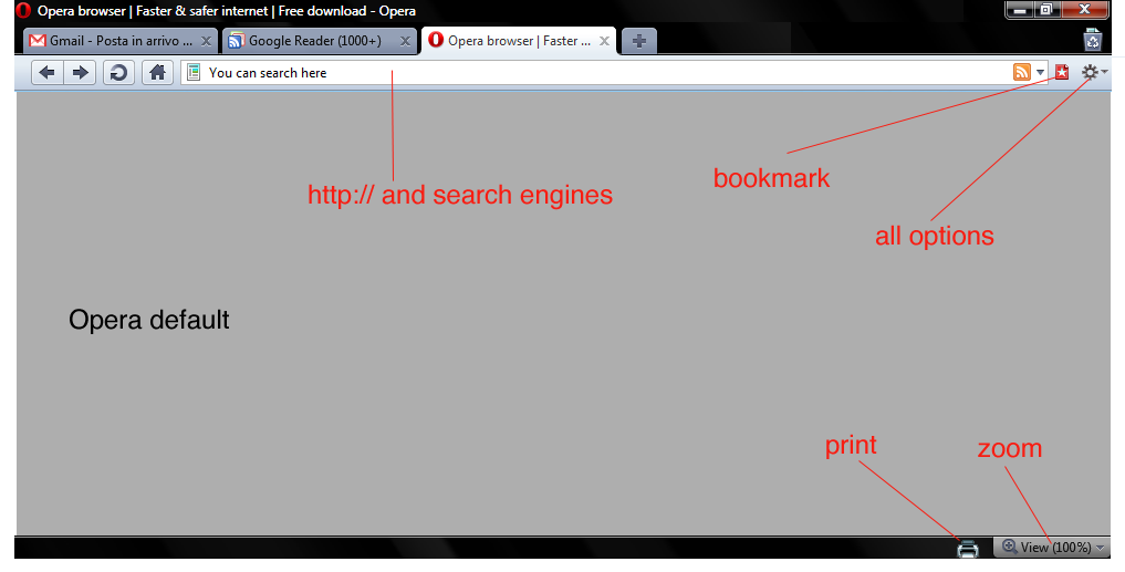
Opera with all the menus

Download the Photoshop file with the design
And this is it. I think there are many menus that actually nobody uses.
With the default settings of Opera you can navigate, search, zoom, print, bookmark. Nothing else.
If you need to configure Opera Turbo or Opera Unite go to the configuration options in the background options and configure it. If you are advanced user and you need to download torrents go to opera:config configure it.
So again "Keep it simple" for the normal user and leave all the complex stuff in background for advanced uses.
Dragonfly is cool. Specially for me like CSS guy Dragonfly is most important tool. Here are some ideas what can be added to Dragonfly. What about CSS redundancy checker? It could useful for many web designers. Also one thing that I can’t find anywhere, speed simulation directly from the browser. I think that Dragonfly need something exclusive and original in order to be used over Firebug.
Also I think can be handy to add some tools for Mobile development and testing directly from the web browser. I know that there are some online tools like Opera mini demo . But I think that having that tool inside the browser can be cool idea.
Few words about CSS3 - great job Opera CSS team. I really love the Opera strategy about CSS3. I will probably dedicate one post about this issue.
There are probably many other things that can be discussed and talk about but I will leave the comments for that.
Summary: Opera is fast and more important once the page is loaded the navigation is smooth and fluid.
Main issues are confusing UI and plug-in support that with little effort can be resolved. Opera is definitely going in right direction.
Will I continue to use Opera like my default browser? I don’t know. I’m plugin dependent I use plugins for everything (Twitter , Color, Seo, The Grid, Measurements, Spelling, Cookies all Social Network …) . Probably that is the only reason why I’m bonded with Firefox. So for normal browsing I will probably use Opera and for work Firefox.
Question I will you leave you with: What you love and hate about Opera? And what Opera should do to become better browser?
Initiative - Opera 10.50 for one week
Monday, March 08, 2010 { 50 Comments }
We people are very good in supporting initiate for killing things RIP IE6 but sometimes we fail to give support when something good and cool happens.Maybe you heard Opera 10.50 is out and is fastest browser in the world.
I’m passionate Firefox user mostly because of various developer plugins and simply because I used to use Firefox.
For me Opera was just test browser for testing my web sites, but often thought that Opera deserves more attention . I was always fascinated by the small Norwegian company that had always good browser but very often bad marketing strategy. Opera was not always free and if they relisted the free version when we had only IE and Netscape, Opera would probably had different market share today.
I want to call up one initiative: Opera 10.50 like your primary browser for one week.
So give Opera a chance. Test it. Use it.
Why to use Opera?
Fastest JavaScript engine - Carakan
CSS3 and HTML5 Support – (For me personally like CSS Framework builder this is most important part)
Opera has invested a lot in full support of CSS and HTML standards . In early days Opera had big issues with compatibility and standard. If I hate some browser more than IE6 it will probably be Opera 7.
But today among Opera staff we have Håkon Wium Lie the father of CSS, Molly Holzschlag , Bruce Lawson , David Storey , Chris Mills and probably many more that I don’t know.
This people are guarantee that Opera will follow the path of Web Standards and HTML5 and CSS3 implementation.
There are many other features that Opera provides, but for me personally is interesting is dragonfly ( It is like firebug for Opera). ). I will try to discover new plugins and addons this week.
I recently discovered Opera Widgets it is something like Adobe AIR but with less RAM consumption.
I also discovered that with Opera you can download torrents, I probably will never trade uTorrent for anything but it’s cool to know that you can actually download torrents with the browser.
Why I’m doing this experiment?
Probably because I want to try to survive one week without Firefox and the second thing I meet two Opera team members last year on one web conference(Molly and David) who ensure me that Opera is going in right direction.
Again. The experiment is use Opera 10.50 for one week like your primary browser. In this week try to find all good and bad stuff about Opera. Than is up to you if you continue with Opera or not.
Are you willing to try this experiment with me?
Update: Opera 10.50 for one week - Summary
Quark – mini php CMS
Monday, March 01, 2010 { 12 Comments }
Quark is probably the smallest Content Management System build with PHP. It’s actually build of one PHP function.It’s meant to help web designers to manage small web sites.
Why I build it?
I work mostly for one firm where we hand code everything. When we build web site we start from scratch. So we build the web site and the management behind the site for our clients, often the management behind the site is more complex then the web site itself. For every site the programming and web logic is different. That is why we need a lot of time to build everything, result we are expensive.
In order to be more competitive for the clients with the less budget we tried to use Joomla. We get very enthusiastic at the beginning specially the part where we don’t have to develop the admin part. But after two years we realize that the time for developing is almost equal but we charge less. Other problems we pray that hackers don’t attack us, that component developers give continuous support and the critical point how you debug 3000 – 5000 file monster. I repeat 3000 php files for one web site … WTF!? Don’t get me started about the quality of HTML , CSS and quality of major of Joomla templates.
So I tried to try to resolve the problem, first I tried to build system that will be able to automatically manage any MySQL database by creating MySql Lite Administrator. Only thing is you need primary key in the tables . Everything else is automatic.
Then I wanted to build CMS for the front, but I didn’t had time and I right “philosophic” ideas how complex should be the system . Then I sow CushyCMS and liked the simplicity but didn’t like that you should change the CSS logic in order to work. Then I saw the video on Drew McLellan's - Perch and I sad this is it! This is the principle that I was looking. So I decided to start from Perch idea and build something damn simple.
So I did it, one PHP function and one MySQL table. And this is it. I name it Quark after the Quark particle . A quark is an elementary particle and a fundamental constituent of matter.
The principle is simple you replace text or html with . So you can put plain text or html for links, images, link list and many more.
If you have very simple site and you want to edit few things like menu, some text this is right solution . I think with little creativity you can make a lot of stuff. The main point to this project is to add dynamic parts to your static small site. So you can build static HTML + CSS site and then make editable some parts like menu, text, links, images est.
Quark does not mange forms so you can’t use it like blog platform. Quark is not meant to replace big CMS like Joomla and Drupal.
And for the management of the DB you can use MySql Lite Administrator or build your own managing system.
If you need to manage forms, resize images ,multilingual support you can purchase Perch or some other small CMS.
Some technical details: Like I said before Quark is made of one php function and MySQL table. You can use PHP4 or PHP5. The php function is extremely simple to understand so everyone with little knowledge of PHP can understand it. My goal was to make very fast MySQL interrogation I was experimenting mainly with mysql_fetch_array and mysql_fetch_row and the results are there are no notable differences.
I tried to run 25 calls(20kb each) to database with total amount of 55.000 words or 85 word document pages with Lorem ipsum text time of execution 0.1 seconds and 0.09 MB Ram. My point is this thing is quick even if you have large amount of data.
How to use it?
There are three columns inside the DB table called quark_table one columns is content and another called name_tag.
| id | content | name_tag |
|---|---|---|
| Put any content inside lorem ipsum, HTML .. | ipsum | |
| 2 | Any HTML or text | any_name_you_like |
So inside HTML you can call the or .
Important to remember that you can choose any name you like so you have absolute freedom of naming your tags. The names should be unique.
And that is it.
When to use it?
Imagine that you have 10 page pure HTML + CSS site the client ask you to add one extra page on the site and to put one link that that will lead to the new page. If you have the same link structure in all 10 pages you will probably go page to page and change manually all the pages.
Or with Quark you will make something like and change it just once.
Same goes for all the repeating multiple parts of your static HTML like header, footer obviously depending on your site architecture.
Download:
Download Quark +DB Structure + Demo
For managing MySQL table you can use MySql Lite Administrator
Disclaimer: I wasn’t sure how to call this project Is it CMS, Is it PHP Template engine or just one simple nifty php function. In some way this project Manages the Content so Content Management System it is.


About Me <<<
Name: Vladimir Carrer
vladocar [at] gmail.com
Location: Verona, Italy
I'm a web designer, developer, teacher, speaker, generally web addicted ...
My projects <<<
- AI Prompt Directory
- Hand Drawn Icons
- Font Design Inspiration
- Font Pairings
- Free SVG Cut File
- Upcoming NFT projects
- Discord Tutorials
- Free Sublimation Designs
- Tech Feed
- MySQL Lite Administrator
- Quark Mini PHP CMS
- Formy - CSS Form Framework
- Emastic - CSS Framework
- Malo - CSS Library
- The Golden Grid
- 1 line CSS Grid Framework
- Two Lines CSS Framework
- Child Selector System - CSS Framework
- Better Web Readability Project
- Azbuka - CSS Typographical Base Rendering Library
- ClipR - bookmarklet for better reading
- CSS3 Action Framework
- CSS Mini Reset
- HTML5 Mini Template
- CSS Mobile Reset
- picoCSS - JavaScript Framework
- HTML Lorem Ipsum Crash Test
- Object Auto Documentation - JavaScript
- o - JS Library for Object Manipulation
- Foxy - CSS Framework
- Tumblr Free Theme - Better Readability Project
- Box - CSS Framework
- SMART CSS GRID
- nanoJS - Minimal JS DOM Library
- Flexy CSS Framework
- Katana is CSS Layout System made with Flexbox
- Micro CSS Reset
- 60 Grid System
- Simple CSS Button
- ramd.js JavaScript library for making web applications.
- Minimal Notes web app build with Vue.js
- Scribble Font for Prototyping & Wireframing
- Flex One - 1 CSS Class System
- Floaty - CSS Float Based Layout System
- Infinity CSS Grid
- CLI Convert websites into readable PDFs
- keywords-extract - CLI tool, extract keywords from any web page.
- screenshoteer - Make website screenshots and mobile emulations from the command line.
- Basic.css - Classless CSS Starter File
§§Previous Posts <<<
- GPT-3 and CSS Frameworks
- Don’t use CSS Reset use CSS Set
- One Page 2020 Calendar Print Version
- 3 CLI tools based on Node.js
- Scribble Font for Prototyping & Wireframing
- ramd.js - Small JavaScript library for making TODO...
- Katana.scss - CSS Layout System made with Flexbox
- Flexy CSS Framework
- nanoJS - JavaScript for DOM manipulation
- SMART CSS GRID

§Archives <<<
- May 2006
- June 2006
- July 2006
- August 2006
- September 2006
- October 2006
- January 2007
- February 2007
- October 2007
- April 2008
- June 2008
- July 2008
- August 2008
- September 2008
- November 2008
- December 2008
- January 2009
- February 2009
- March 2009
- April 2009
- May 2009
- June 2009
- August 2009
- September 2009
- October 2009
- November 2009
- December 2009
- January 2010
- February 2010
- March 2010
- April 2010
- May 2010
- June 2010
- July 2010
- August 2010
- September 2010
- October 2010
- November 2010
- December 2010
- January 2011
- February 2011
- March 2011
- April 2011
- May 2011
- June 2011
- July 2011
- August 2011
- September 2011
- October 2011
- November 2011
- December 2011
- January 2012
- February 2012
- March 2012
- April 2012
- June 2012
- August 2012
- November 2012
- January 2013
- March 2013
- June 2013
- October 2013
- November 2013
- March 2014
- September 2014
- October 2014
- November 2015
- March 2018
- May 2018
- June 2018
- July 2018
- October 2018
- January 2019
- January 2020
- June 2020
- April 2021
Other Profiles <<<

Content is licensed under a Creative Commons Public Domain License