{Carrer web log}
The Golden Grid
Tuesday, February 17, 2009 { 22 Comments }
For some time now I’m devoted completely to Web Grid Design. First I built Emastic then Malo and now The Golden Grid.Emastic is a very complete CSS Framework integrating various CSS construction techniques like floats, absolute positioning, complete freedom of your default width, extra usability with em based grid system plus possibility of fluid columns and extra % based grid system and many more features. Then the question is why build another grid system.
I was searching for the prefect web grid, playing with golden proportions, rule of thirds, symmetry, asymmetry, usability, monitor proportions, typography and the result came spontaneous - The Golden Grid. Why not share it with you :).
Philosophy
Dimensions
One, Two, Three - jump. Where is four? We usually stop at tree. Why? Three is the magic number. Three is a lucky number. Three is the fourth of Fibonacci. It is the first number that breaks the symmetry of 2.
I decided to build the golden grid based on this number.
3 + 3 and 3 + 3 + 3 +3 => 6/12 grid system
Default width 970px or 10px + 960px
780px is the number of past, 960px is the number of today and 1200px will be the number of the future (see the table link). 1200px is the perfect number for my grid system, but it's too soon for that. First I must wait the usage rate of 1024 X 768 monitors to drop under 10%.
Columns
In the 6 columns grid min. width column is 150px and the gutter of 10px.
In the 12 column grid min. width column is 70px and the gutter of 10px.
I stopped at 12 columns because I think 12 is ideal number for one web grid. 4 x 3 = 12 .When the harmony and symmetry of 4 meats chaotic 3 the result is 12.
Rule of Thirds (golden rule)
Wikipedia:
The rule states that an image should be imagined as divided into nine equal parts by two equally-spaced horizontal lines and two equally-spaced vertical lines, and that important compositional elements should be placed along these lines or their intersections. Proponents of the technique claim that aligning a subject with these points creates more tension, energy and interest in the composition than simply centering the subject would.
I love Wikipedia's interpretation of the golden rule -> creates more tension, energy and interest. But why?
This question still troubles me. Is it in our DNA, is it just the way we look at things or some fractal space and time distortion. Joke aside, I don’t have the answer, but that will not stop me to implement this rule on my grid :).
Typography
Using typography.css is optional in this project. Not all web sites have the same typographical needs. The main purpose is to give character to this project. If we imagine the grid as the naked body than typography would be the clothes.
I used ” lucida grande","lucida sans unicode" like main typeface. For titles H1 to H6 I used Georgia. I like to mix Serif and sans-serif fonts.
Image and Video size
You might consider some popular formats (4:3) and (9:16)
CSS building technique and naming system
There are two known div building techniques: floats and position. The Golden Grid uses float:left.
Class names g160 means golden 160px or grid 160px = 150px + 10px margin.
ml80 meaning margin-left:90px or 10 + 80px
Inside for needed divs and clear.
And this is it.
Similarity to other CSS project
There are many who will notice the similarity to some other CSS Frameworks like Blueprint and 960.gs and in some parts like my Emastic. Yes, the building principle is very similar - float:left, margin-left, structural naming system, px based columns... If you are familiar with these systems, you like their philosophy and you are not min. css file size maniac like me I don’t see the reason why change anything. They all do a great job.
The Golden Grid is not about how I build CSS web grids but why. It is result of almost one year research of web grid design.
The Golden Grid + Examples
Download
Cheers!
Sketchbook for web designers
Thursday, February 12, 2009 { 36 Comments }
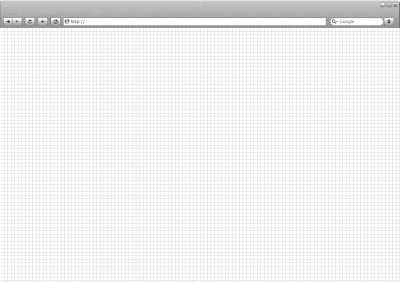
Recently I saw one cool sketchbook for designing web site mockups. The problem was I couldn't find out how to order one copy. The idea of that sketchbook was to simulate web browser on paper.So I decided to build one.
First problem that we encounter when we are building web browser on paper is - what size should it be? We have monitors with different size. And we also have different paper formats A4, A3... First thing I did is to compare the most common A4 format with my 15' laptop. And i realized that A4 (210x297mm) width is actually my laptop monitor height or 210mm. A4 is perfect for building our sketchbook because it fits perfectly on monitor and is most used paper format.
What web browser should we simulate? From the ergonomic point of view I prefer Chrome or Safari. My final decision is Safari, because it is gray and it is perfect for B/W printers.
Ok, we have Safari on A4 paper and we can print B/W. Little work in photoshop and the final result is:
In PSD file you will find everything you need Photoshop
Don't forget to set landscape when you print.
Enjoy!


About Me <<<
Name: Vladimir Carrer
vladocar [at] gmail.com
Location: Verona, Italy
I'm a web designer, developer, teacher, speaker, generally web addicted ...
My projects <<<
- AI Prompt Directory
- Hand Drawn Icons
- Font Design Inspiration
- Font Pairings
- Free SVG Cut File
- Upcoming NFT projects
- Discord Tutorials
- Free Sublimation Designs
- Tech Feed
- MySQL Lite Administrator
- Quark Mini PHP CMS
- Formy - CSS Form Framework
- Emastic - CSS Framework
- Malo - CSS Library
- The Golden Grid
- 1 line CSS Grid Framework
- Two Lines CSS Framework
- Child Selector System - CSS Framework
- Better Web Readability Project
- Azbuka - CSS Typographical Base Rendering Library
- ClipR - bookmarklet for better reading
- CSS3 Action Framework
- CSS Mini Reset
- HTML5 Mini Template
- CSS Mobile Reset
- picoCSS - JavaScript Framework
- HTML Lorem Ipsum Crash Test
- Object Auto Documentation - JavaScript
- o - JS Library for Object Manipulation
- Foxy - CSS Framework
- Tumblr Free Theme - Better Readability Project
- Box - CSS Framework
- SMART CSS GRID
- nanoJS - Minimal JS DOM Library
- Flexy CSS Framework
- Katana is CSS Layout System made with Flexbox
- Micro CSS Reset
- 60 Grid System
- Simple CSS Button
- ramd.js JavaScript library for making web applications.
- Minimal Notes web app build with Vue.js
- Scribble Font for Prototyping & Wireframing
- Flex One - 1 CSS Class System
- Floaty - CSS Float Based Layout System
- Infinity CSS Grid
- CLI Convert websites into readable PDFs
- keywords-extract - CLI tool, extract keywords from any web page.
- screenshoteer - Make website screenshots and mobile emulations from the command line.
- Basic.css - Classless CSS Starter File
§§Previous Posts <<<
- GPT-3 and CSS Frameworks
- Don’t use CSS Reset use CSS Set
- One Page 2020 Calendar Print Version
- 3 CLI tools based on Node.js
- Scribble Font for Prototyping & Wireframing
- ramd.js - Small JavaScript library for making TODO...
- Katana.scss - CSS Layout System made with Flexbox
- Flexy CSS Framework
- nanoJS - JavaScript for DOM manipulation
- SMART CSS GRID
§Archives <<<
- May 2006
- June 2006
- July 2006
- August 2006
- September 2006
- October 2006
- January 2007
- February 2007
- October 2007
- April 2008
- June 2008
- July 2008
- August 2008
- September 2008
- November 2008
- December 2008
- January 2009
- February 2009
- March 2009
- April 2009
- May 2009
- June 2009
- August 2009
- September 2009
- October 2009
- November 2009
- December 2009
- January 2010
- February 2010
- March 2010
- April 2010
- May 2010
- June 2010
- July 2010
- August 2010
- September 2010
- October 2010
- November 2010
- December 2010
- January 2011
- February 2011
- March 2011
- April 2011
- May 2011
- June 2011
- July 2011
- August 2011
- September 2011
- October 2011
- November 2011
- December 2011
- January 2012
- February 2012
- March 2012
- April 2012
- June 2012
- August 2012
- November 2012
- January 2013
- March 2013
- June 2013
- October 2013
- November 2013
- March 2014
- September 2014
- October 2014
- November 2015
- March 2018
- May 2018
- June 2018
- July 2018
- October 2018
- January 2019
- January 2020
- June 2020
- April 2021
Other Profiles <<<

Content is licensed under a Creative Commons Public Domain License