{Carrer web log} ←
CSS3 Chat Bubbles
Monday, December 20, 2010 { 13 Comments }
Few day ago I saw on Hacker News the link Creating Triangles in CSS from Jon Rohan(kudos to JON) and was specially interesting for the chat bubbles. Mainly because I was building one mini app for Twitter who should run on iPhone/iPad (webkit browser) so I needed simple solution for the chat bubbles.Jon uses this HTML :
<div class="chat-bubble">
Buongiorno!
<div class="chat-bubble-arrow-border"></div>
<div class="chat-bubble-arrow"></div>
</div>
I wanted to use just one div to create the same effect and make CSS to do all the heavy lifting:
<div class="chat-bubble"></div>
After some CSS hacking here is the result:
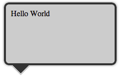
Example
Example1
Example2
Example3
Example4
From the examples you can see that everything is done with CSS and no images are used for making Chat Bubbles and also the HTML is super simple just one div and one class (<div class="chat-bubble"></div>).
The trick is using :before and :after pseudo-elements with combination of content: " " and absolute, relative positioning. In this case both :after and :before work in the same way because there are absolute positioned. This technique work in all modern CSS3 supported browsers.
If you have any questions please let me know in the comments.
All the examples are also on github for download.
[Update] Today Nicolas Gallagher point to me that he came to this technique 8 months ago Pure CSS speech bubbles . Unfortunately I didn't know about his post and I was careless not to check about other CSS chat bubble solution. And the worst thing is I have no prove beside my gentleman's word that I didn't copy his technique. Sorry Nicolas!
13 Responses to “CSS3 Chat Bubbles”
-
//
 Unknown
// 12/20/2010
Unknown
// 12/20/2010
-
//
 // 12/20/2010
-
// Vladimir
// 12/21/2010
-
// Nicolas Gallagher
// 12/21/2010
-
// Vladimir
// 12/21/2010
-
// Nicolas Gallagher
// 12/21/2010
No worries. You did invent something cool. Doesn't matter who did it first. Maybe someone was using it years ago but they never made a post about it.
I thought you might like to see some of the other speech and thought bubble effects you can do with this technique...and the interesting things with using it for backgrounds. Please share anything you make with pseudo-elements. I'd love to see it. -
//
// 12/23/2010
-
// Vladimir
// 12/23/2010
@elFr!qui: Imagine that you some text and you want to put quotes before and after in the text without inserting them(") in the text directly. You can use :before and :after are content: "Any text you like in this case quotes ". But in this case :before and :after are used to display the triangle and the shadow under the triangle. And this is possible because there are absolutely positioned to the relative base. Ok I know that at this point you are more confused than before :) Try to download the examples and play with the code by changing only left,right, bottom example form bottom: 0px to bottom: 60px. And if you have more questions please let me know.
-
// Beben Koben
// 1/01/2011
-
//
// 1/04/2011
-
// chat
// 3/21/2011
-
// Brett Widmann
// 4/10/2011
-
// St. Louis Web Design
// 5/31/2011
<< Home


About Me <<<
Name: Vladimir Carrer
vladocar [at] gmail.com
Location: Verona, Italy
I'm a web designer, developer, teacher, speaker, generally web addicted ...
My projects <<<
- AI Prompt Directory
- Hand Drawn Icons
- Font Design Inspiration
- Font Pairings
- Free SVG Cut File
- Upcoming NFT projects
- Discord Tutorials
- Free Sublimation Designs
- Tech Feed
- MySQL Lite Administrator
- Quark Mini PHP CMS
- Formy - CSS Form Framework
- Emastic - CSS Framework
- Malo - CSS Library
- The Golden Grid
- 1 line CSS Grid Framework
- Two Lines CSS Framework
- Child Selector System - CSS Framework
- Better Web Readability Project
- Azbuka - CSS Typographical Base Rendering Library
- ClipR - bookmarklet for better reading
- CSS3 Action Framework
- CSS Mini Reset
- HTML5 Mini Template
- CSS Mobile Reset
- picoCSS - JavaScript Framework
- HTML Lorem Ipsum Crash Test
- Object Auto Documentation - JavaScript
- o - JS Library for Object Manipulation
- Foxy - CSS Framework
- Tumblr Free Theme - Better Readability Project
- Box - CSS Framework
- SMART CSS GRID
- nanoJS - Minimal JS DOM Library
- Flexy CSS Framework
- Katana is CSS Layout System made with Flexbox
- Micro CSS Reset
- 60 Grid System
- Simple CSS Button
- ramd.js JavaScript library for making web applications.
- Minimal Notes web app build with Vue.js
- Scribble Font for Prototyping & Wireframing
- Flex One - 1 CSS Class System
- Floaty - CSS Float Based Layout System
- Infinity CSS Grid
- CLI Convert websites into readable PDFs
- keywords-extract - CLI tool, extract keywords from any web page.
- screenshoteer - Make website screenshots and mobile emulations from the command line.
- Basic.css - Classless CSS Starter File
§§Previous Posts <<<
- Line length and Font Size relation in design
- Safari - open links in new tabs
- Hacker News Mobile (Front Page Reader )
- CSS Mobile Reset
- About JSONP in JavaScript
- Two Lines CSS Framework
- About the dollar sign ($) in JavaScript
- Canvas Grid - JS1K entry
- I have great startup idea: It’s Hacker News ReDesign
- Fireworks Mini Web Wireframing Kit
Other Profiles <<<

Content is licensed under a Creative Commons Public Domain License