{Carrer web log} ←
Two Lines CSS Framework
Tuesday, October 26, 2010 { 19 Comments }
I love to experiment with CSS layouts. One year ago I made 1 line CSS Framework now here is two lines CSS Framework. Both are mainly build for teaching purposes. Avoid using them in production.Last week I spotted the article "Announcing The Oxymoron CSS Framework" and I decided to "shrink it" preserving only display:table; and display:table-cell;
Here is the code:
.row { display:table; width:960px; margin:0 auto }
.cell { display:table-cell; vertical-align:top; padding-left:10px }
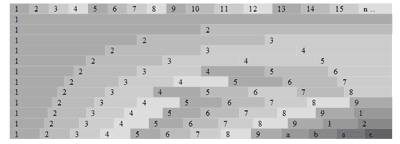
With this two lines of CSS you can build n. column grid system.
Five column system will look like:
<div class="row">
<div class="cell">1</div>
<div class="cell">2</div>
<div class="cell">3</div>
<div class="cell">4</div>
<div class="cell">5</div>
</div>
You can add as many "cells" as you like.
Here is the demo.
How this system works?
By combining display:table and display:table-cell you have the container(.row) and the columns(.cell), any row can contain many cells.
All cells by default are fluid. There is no need of Float and clearing. The width of all cells can be additionally defined. So there are literally endless combination of columns. You can mix px,em,% and fluid colmns.
Example 1
Code explanation:
.row {
display:table; /* The container */
width:960px; /* Any width, you can also use % and ems */
margin:0 auto /* Centered */
}
.cell {
display:table-cell; /* column */
vertical-align:top; /* align to top */
padding-left:10px /* the default gutter, you can personalize your gutter size */
}
Here are also two more examples:
Example 2
Example 3
So you can personalize your main width, columns size, gutter size, you can use %, ems or default fluid width and choose to center or not your main layout . Pretty powerful don’t you think?
Unfortunately this system will not work in IE 6/7 and some older browsers.
You probably noticed the similarities with classical tables coding approach (table, td, tr) and someone will think that this method is trying to reinvent the tables. What changes?
When the CSS is used for styling layouts the main goal is to separate the content from presentation. So in this case we have the CSS who is controlling the content without the use of table tags.
Today we are playing with the new CSS3 "make up" tricks forgetting that the main problem in CSS is the layout and we still don’t have good layout model who will satisfy all our designer needs.
This Framework is just an experiment that can help you understand different CSS layout models and coding approaches.
The code and the examples are also available on GitHub.
19 Responses to “Two Lines CSS Framework”
-
//
 droope
// 10/26/2010
droope
// 10/26/2010
-
//
// 10/26/2010
-
// Annonces Immobilières
// 10/27/2010
-
//
// 10/27/2010
-
// Matteo Balocco
// 10/27/2010
-
//
 Vladimir
// 10/27/2010
Vladimir
// 10/27/2010
@Anonymous: From my answer on reddit:
"Do this approach is reinventing the tables? Unfortunately the "float" method has many limits. Example making fluid columns with float is super complex (http://www.alistapart.com/articles/holygrail/). CSS3 doesn't offer the solution for better layout model. So we do our best with the tools we have. With this model you can build almost any kind of layout. Why is different from the classic tables? Because it is the CSS who is controlling the layout. Insert different CSS and the layout will behave differently. The goal is to separate the content from presentation. "
@Matteo: Thanks! -
// Matteo Balocco
// 10/28/2010
-
// Vladimir
// 10/28/2010
-
// Beben Koben
// 10/29/2010
-
// Vladimir
// 10/29/2010
-
//
// 10/29/2010
-
// Vladimir
// 10/29/2010
-
// Alex Burr
// 10/29/2010
I disagree with Anonymous. Using class="row" and class="cell" in this example are non-semantic, but there's no reason you can't find a semantic justification for grouping that content that is reflected in your class names.
The layout should reflect some semantics, in that related information is positioned accordingly (ie "article" or "sidebar"). From there it's easy to use the same CSS properties Carrer has defined in ".cell". -
//
// 1/16/2012
Holy crap, thanks! I used to develop basic websites back in the late 1990's early 2000's on the side. I used tables exclusively, but it became such a headache for compatibility between browsers. Just trying to make a simple site for a side business I'm starting and this looks brilliant and easy to get started. Kudos and thanks. Sometimes the simplest things are the hardest to start. lol.
-
// Fatan
// 1/28/2012
-
// Soul Sanctuary
// 12/13/2012
@Fatan It's 2012 People should stop coding for browser that are so outdated and so bad at following web standards. If web designers didn't bother to accommodate people using such outdated crap they would be forced to change their habits and upgrade. I don;t know why many businesses insist on trying to work with people so stuck in the stone age anyway, their so unlikely to buy anything new it seems like a complete waste of time and money.
-
// self deprecating
// 4/06/2013
.row { display:table; width:960px; margin:0 auto }
.cell { display:table-cell; vertical-align:top; padding-left:10px }
How do you add backgroung color to either the css row or cell code?
I tried editing the .row css code:
.row { display:table; width:960px;background-color:red; margin:0 auto }
but it does not display the background color. -
//
// 6/12/2014
-
//
// 6/13/2014
And yes, this table-based approach doesn't allow you to build a layout where, for exaple 1 column is 25% wide and other is 75% wide. When true CSS3 attr() function (not that crappy version from CSS2.1) is implemented in browsers, ideal grid will be nothing more than the following CSS line (the cells are flex-containers themselves):
.flex{display:flex;flex:attr(data-pan,integer,1)}
Note is can't work yet as true CSS3 attr works nowhere yet. But even without attr, if you specify just flex:1 there:
.flex{display:flex;flex:1}
- you'll be able to use inline style=flex:[your span number] to control how much space it takes. Very comfortable.
<< Home


About Me <<<
Name: Vladimir Carrer
vladocar [at] gmail.com
Location: Verona, Italy
I'm a web designer, developer, teacher, speaker, generally web addicted ...
My projects <<<
- AI Prompt Directory
- Hand Drawn Icons
- Font Design Inspiration
- Font Pairings
- Free SVG Cut File
- Upcoming NFT projects
- Discord Tutorials
- Free Sublimation Designs
- Tech Feed
- MySQL Lite Administrator
- Quark Mini PHP CMS
- Formy - CSS Form Framework
- Emastic - CSS Framework
- Malo - CSS Library
- The Golden Grid
- 1 line CSS Grid Framework
- Two Lines CSS Framework
- Child Selector System - CSS Framework
- Better Web Readability Project
- Azbuka - CSS Typographical Base Rendering Library
- ClipR - bookmarklet for better reading
- CSS3 Action Framework
- CSS Mini Reset
- HTML5 Mini Template
- CSS Mobile Reset
- picoCSS - JavaScript Framework
- HTML Lorem Ipsum Crash Test
- Object Auto Documentation - JavaScript
- o - JS Library for Object Manipulation
- Foxy - CSS Framework
- Tumblr Free Theme - Better Readability Project
- Box - CSS Framework
- SMART CSS GRID
- nanoJS - Minimal JS DOM Library
- Flexy CSS Framework
- Katana is CSS Layout System made with Flexbox
- Micro CSS Reset
- 60 Grid System
- Simple CSS Button
- ramd.js JavaScript library for making web applications.
- Minimal Notes web app build with Vue.js
- Scribble Font for Prototyping & Wireframing
- Flex One - 1 CSS Class System
- Floaty - CSS Float Based Layout System
- Infinity CSS Grid
- CLI Convert websites into readable PDFs
- keywords-extract - CLI tool, extract keywords from any web page.
- screenshoteer - Make website screenshots and mobile emulations from the command line.
- Basic.css - Classless CSS Starter File
§§Previous Posts <<<
- About the dollar sign ($) in JavaScript
- Canvas Grid - JS1K entry
- I have great startup idea: It’s Hacker News ReDesign
- Fireworks Mini Web Wireframing Kit
- iPhone Wireframe Kit - Google Docs
- HTML5 Mini Template
- GReadable - readability bookmarklet for Google Re...
- TweetThisPage - bookmarklet for fast twitter posting
- Bulletproof CSS3 media queries
- Distributed Color Palette – Photoshop Tool
Other Profiles <<<

Content is licensed under a Creative Commons Public Domain License