{Carrer web log} ←
Calendar 2010
Wednesday, December 23, 2009 { 4 Comments }
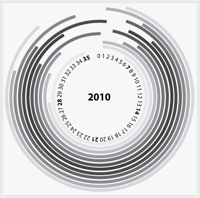
First I will start some with some self-criticism this is perfect example when design fails to be effective. If the propose of the design is to be simple and self explaining this is not the case. This is the example when you need the manual to explain the design. And I hate that.So why I did it. In this case I wanted to be design for design (L'Art Pour L'Art) maybe because I need to go around my "everything should be usable" principle.
I imagined that the design of the calendar should be circular, Earth takes about 365.25 days to go around the Sun making elliptical trajectory and that is one year.
In astronomy, unlike geometry, 360° means returning to the same point in some cyclical time scale, either one mean solar day or one sidereal day for rotation on Earth's axis, or one sidereal year or one mean tropical year or even one mean Julian year containing exactly 365.25 days for revolution around the Sun.
- Wikipedia
So symbolically I used "round" design and the final result is this:

The bolded numbers like 7,14,21,28,35 are Sunday. So the numbers represent the days of the week. So one is not one is Monday. The circle line starts from the first day of the month. For 1-st January (the white line closest to circle numbers) we have Friday or 5 so we starts from 5 + 31 days and ends up 35.
I also made a mathematical model and heat map of the average temperature range of all the months and seasons. To get more simple white is cold , black is hot.
You can see more details here : Spreadsheets
Play around with the Illustrator .ai file: Calendar2010.zip
4 Responses to “Calendar 2010”
-
//
// 12/23/2009
I just can't understand why didn't you draw a perfect endless circle for day numbers, from 1 to 35 and looping it (no zero...).
However, it's a clever intuition, but it's also a bit exoteric.
What I'd miss in using it? Well, there's not a coupling between the days of the week and the number of the day in the current month. So it's quite impressive as infographic design but also unusable.
What you could try: 1) use two different and alternate shades of gray to radially isolate the single days of the month. 2) use day numbers instead of solid color rings. 3) use day abbreviations instead of meaningless numbers (1-35).
Probably trying all of them will end in a terrible graphic mess, so read my suggestion just for the sake of kindness, the forget them. ;-) - // NeonBlueWS // 12/24/2009
- // // 1/06/2010
- // Vladimir // 1/06/2010
<< Home
About Me <<<
Name: Vladimir Carrer
vladocar [at] gmail.com
Location: Verona, Italy
I'm a web designer, developer, teacher, speaker, generally web addicted ...
My projects <<<
- AI Prompt Directory
- Hand Drawn Icons
- Font Design Inspiration
- Font Pairings
- Free SVG Cut File
- Upcoming NFT projects
- Discord Tutorials
- Free Sublimation Designs
- Tech Feed
- MySQL Lite Administrator
- Quark Mini PHP CMS
- Formy - CSS Form Framework
- Emastic - CSS Framework
- Malo - CSS Library
- The Golden Grid
- 1 line CSS Grid Framework
- Two Lines CSS Framework
- Child Selector System - CSS Framework
- Better Web Readability Project
- Azbuka - CSS Typographical Base Rendering Library
- ClipR - bookmarklet for better reading
- CSS3 Action Framework
- CSS Mini Reset
- HTML5 Mini Template
- CSS Mobile Reset
- picoCSS - JavaScript Framework
- HTML Lorem Ipsum Crash Test
- Object Auto Documentation - JavaScript
- o - JS Library for Object Manipulation
- Foxy - CSS Framework
- Tumblr Free Theme - Better Readability Project
- Box - CSS Framework
- SMART CSS GRID
- nanoJS - Minimal JS DOM Library
- Flexy CSS Framework
- Katana is CSS Layout System made with Flexbox
- Micro CSS Reset
- 60 Grid System
- Simple CSS Button
- ramd.js JavaScript library for making web applications.
- Minimal Notes web app build with Vue.js
- Scribble Font for Prototyping & Wireframing
- Flex One - 1 CSS Class System
- Floaty - CSS Float Based Layout System
- Infinity CSS Grid
- CLI Convert websites into readable PDFs
- keywords-extract - CLI tool, extract keywords from any web page.
- screenshoteer - Make website screenshots and mobile emulations from the command line.
- Basic.css - Classless CSS Starter File
§§Previous Posts <<<
- Bookmarklet for Google Dictionary
- To Do List (A4 Paper – Grid Design)
- Azbuka - CSS Typographical Base Rendering Library
- Serif vs. sans-serif legibility
- CSS Specificity Coding Method
- Designing typographical wallpapers for iPhone
- CSS Specificity - Cheat Sheet
- Blog prototyping with Emastic using the Golden Pro...
- 4 useful Bookmarklet for Twitter, Google, CSS, SEO
- Twitter Unofficial Redesign
Other Profiles <<<
Content is licensed under a Creative Commons Public Domain License


